Quantcast
Channel: R-bloggers
Viewing all 12128 articles
Browse latest View live

Bernoulli factory in the Riddler

$
0
0

[This article was first published on R – Xi'an's Og, and kindly contributed to R-bloggers]. (You can report issue about the content on this page here)
Want to share your content on R-bloggers? click here if you have a blog, or here if you don't.

“Mathematician John von Neumann is credited with figuring out how to take a p biased coin and “simulate” a fair coin. Simply flip the coin twice. If it comes up heads both times or tails both times, then flip it twice again. Eventually, you’ll get two different flips — either a heads and then a tails, or a tails and then a heads, with each of these two cases equally likely. Once you get two different flips, you can call the second of those flips the outcome of your “simulation.” For any value of p between zero and one, this procedure will always return heads half the time and tails half the time. This is pretty remarkable! But there’s a downside to von Neumann’s approach — you don’t know how long the simulation will last.” The Riddler

The associated riddle (first one of the post-T era!) is to figure out what are the values of p for which an algorithm can be derived for simulating a fair coin in at most three flips. In one single flip, p=½ sounds like the unique solution. For two flips, p²,(1-p)^2,2p(1-p)=½ work, but so do p+(1-p)p,(1-p)+p(1-p)=½, and the number of cases grows for three flips at most. However, since we can have 2³=8 different sequences, there are 2⁸ ways to aggregate these events and thus at most 2⁸ resulting probabilities (including 0 and 1). Running a quick R code and checking for proximity to ½ of any of these sums leads to

[1] 0.2062997 0.7937005 #p^3[1] 0.2113249 0.7886753 #p^3+(1-p)^3[1] 0.2281555 0.7718448 #p^3+p(1-p)^2[1] 0.2372862 0.7627143 #p^3+(1-p)^3+p(1-p)^2[1] 0.2653019 0.7346988 #p^3+2p(1-p)^2[1] 0.2928933 0.7071078 #p^2[1] 0.3154489 0.6845518 #p^3+2p^2(1-p)[1] 0.352201  0.6477993 #p^3+p(1-p)^2+p^2(1-p)[1] 0.4030316 0.5969686 #p^3+p(1-p)^2+3(1-p)p^2[1] 0.5

which correspond to 1-p³=½, p³+(1-p)³=½,(1-p)³+(1-p)p²=½,p³+(1-p)³+p²(1-p),(1-p)³+2(1-p)p²=½,1-p²=½, p³+(1-p)³+p²(1-p)=½,(1-p)³+p(1-p)²+p²(1-p)=½,(1-p)³+p²(1-p)+3p(1-p)²=½,p³+p(1-p)²+3(p²(1-p)=½,p³+2p(1-p)²+3(1-p)p²=½,p=½, (plus the symmetric ones), leading to 19 different values of p producing a “fair coin”. Missing any other combination?! Another way to look at the problem is to find all roots of the 2^{2^n} equations

a_0p^n+a_1p^{n-1}(1-p)+\cdots+a_{n-1}p(1-p)^{n-1}+a_n(1-p)^n=1/2\quad\text{where}\quad 0\le a_i\le{n \choose i}

(None of these solutions is rational, by the way, except p=½.) I also tried this route with a slightly longer R code, calling polyroot, and finding the same 19 roots for three flips, [at least] 271 for four, and [at least] 8641 for five (The Riddler says 8635!). With an imprecision due to numerical rounding by polyroot. (Since the coefficients of the above are not directly providing those of the polynomial, I went through an alternate representation as a polynomial in (1-p)/p, with a straightforward derivation of the coefficients.)

var vglnk = {key: '949efb41171ac6ec1bf7f206d57e90b8'}; (function(d, t) { var s = d.createElement(t); s.type = 'text/javascript'; s.async = true;// s.defer = true;// s.src = '//cdn.viglink.com/api/vglnk.js'; s.src = 'https://www.r-bloggers.com/wp-content/uploads/2020/08/vglnk.js'; var r = d.getElementsByTagName(t)[0]; r.parentNode.insertBefore(s, r); }(document, 'script'));

To leave a comment for the author, please follow the link and comment on their blog: R – Xi'an's Og.

R-bloggers.com offers daily e-mail updates about R news and tutorials about learning R and many other topics. Click here if you're looking to post or find an R/data-science job.
Want to share your content on R-bloggers? click here if you have a blog, or here if you don't.

The post Bernoulli factory in the Riddler first appeared on R-bloggers.


Using RStudio with Github Classroom

$
0
0

[This article was first published on R Bloggers on Francisco Bischoff, and kindly contributed to R-bloggers]. (You can report issue about the content on this page here)
Want to share your content on R-bloggers? click here if you have a blog, or here if you don't.

img { display: block; margin-left: auto; margin-right: auto;}

In March, 12th, Github has launched the Github Classroom platform.

TL; DR, you can continue.For the long story, click here.

Classroom

For those that want to know more about the capabilities of Github Classroom, I recommend you start here.

Using RStudio

Why do we need this tutorial?Well, Github Classroom already allows an auto-integration with Microsoft MakeCode and Repl.it, but we, as R developers, like RStudio, right?So how to solve this?

The current solution uses mybinder.org as the cloud service that will create our RStudio session.If someone finds out how to use RStudio Cloud automatically, please, send me a message.I’m looking forward to using that.

Step 1 – Create your environment

First, you need to create a repository that will contain the RStudio session settings.That is the best way to do it because if you do not separate the assignment code from the IDE code, every student will have to build its own docker every time they push something new to their assignment.This takes time!

Here I published a template repository where you can derive your configurations:

RStudio MyBinder Environment

Changes you need to make

  • In file .rstudio/projects/settings/last-project-path, you need to change the values there to your own. Leave the /home/jovyan/ there.

Changes you may want to make

  • In file .binder/install.R, you specify the packages that will be installed by default in the environment.

Step 2 – Create the assignment repository

There are some requirements to make this work:

  • The repository must have a .RProj file (e.g., Assignment.Rproj).And this name must be the same you set in Step 1 (in last-project-path).For now, this is a requirement.

  • You must have a README.md with the following link (adapted from the generated URL from nbgitpuller link generator):

Launch Binder
  • Pay attention to the strings you must set: YOUR_USERNAME, YOUR_FORK, YOUR_CLASSROOM.

    Also pay attention that recently, Github is changing the default repository from master to main.

    The variables ${REPOSITORY_SLUG} are variables that will be automatically replaced by a Github action.Explained in the long story post.

    If you generate the README.md from an Rmd file, it is really recommended that you use the plain HTML above since knitr or something else seems to recode the URL, and I could not find a way to disable that.

  • Create a workflow at .github/workflows/configure_readme.yml with the following Github action: replace_envs.And, to avoid this action runs in your template, but in student’s fork, add this line before steps:

if: contains(github.event.head_commit.message, 'Classroom')

Step 3 – The autograding

Github Classroom has an option to create an automatic grading, so the students can push answers for solving the assessment, and the system will automatically verify if it is right.

That is not fancy stuff;you have to define what is right or wrong and how much.

I’ve tried to leave my files in the template repository, but Github Classroom will currently overwrite them when the student accepts the task.

So, how I’m doing currently:

  • Create a test.R file, and use your skills to assess the student’s answer.My lazy approach makes the student save a file called output.rda containing the variable answer, and my script loads the output.rda file and compares the SHA1 of the answer with the right answer.Use quit(status = 0) and quit(status = 1) to tell the system that the answer is ok or not.

  • Create a test.sh file that calls the test.R file.This script can handle several R scripts separately if you want to test for several answers and make partial grading, for example.Just use a bash script like:

echo "Running tests..."if Rscript --vanilla .assets/scripts/test.R ; then echo "Pass: Program exited zero"else echo "Fail: Program did not exit zero" exit 1fiecho "All tests passed."exit 0
  • Finally, when you create the auto-grading in your assignment, choose the options:

    • Repository: Public.That is a limitation (for now) since nbgitpuller doesn’t have access to private repositories.That may be a problem for countries that require that student assignments must be private.

    • Online IDE: Don't use an online IDE.

    • Add test: Run Command.

      In this option, set as setup:

      sudo apt-get update; sudo apt-get remove -y r-base r-base-core; sudo apt-get install -y r-base r-base-core r-cran-digest (this removes and installs again the R in the test environment, because if you use the one it is there, some important packages as r-cran-ggplot2 will fail to install. Additionally, I install the r-cran-digest package that has the SHA1 algorithm.)

      and as run:

      bash .assets/scripts/test.sh

I hope this post can save some academic lives, or at least save some time, and maybe get some Github’s or RStudio’s attention to this matter.

Any comment is welcome.

var vglnk = {key: '949efb41171ac6ec1bf7f206d57e90b8'}; (function(d, t) { var s = d.createElement(t); s.type = 'text/javascript'; s.async = true;// s.defer = true;// s.src = '//cdn.viglink.com/api/vglnk.js'; s.src = 'https://www.r-bloggers.com/wp-content/uploads/2020/08/vglnk.js'; var r = d.getElementsByTagName(t)[0]; r.parentNode.insertBefore(s, r); }(document, 'script'));

To leave a comment for the author, please follow the link and comment on their blog: R Bloggers on Francisco Bischoff.

R-bloggers.com offers daily e-mail updates about R news and tutorials about learning R and many other topics. Click here if you're looking to post or find an R/data-science job.
Want to share your content on R-bloggers? click here if you have a blog, or here if you don't.

The post Using RStudio with Github Classroom first appeared on R-bloggers.

A NOTE on URL checks of your R package

$
0
0

[This article was first published on Posts on R-hub blog, and kindly contributed to R-bloggers]. (You can report issue about the content on this page here)
Want to share your content on R-bloggers? click here if you have a blog, or here if you don't.

Have you ever tried submitting your R package to CRAN and gotten the NOTE Found the following (possibly) invalid URLs:? R devel recently got more URL checks.1 In this post, we shall explain where and how CRAN checks URLs validity, and we shall explain how to best prepare your package for this check. We shall start by a small overview of links, including cross-references, in the documentation of R packages.

Links where and how?

Adding URLs in your documentation (DESCRIPTION, manual pages, README, vignettes) is a good way to provide more information for users of the package.

Links in DESCRIPTION’s Description

We’ve already made the case for storing URLs to your development repository and package documentation website in DESCRIPTION. Now, the Description part of the DESCRIPTION, that gives a short summary about what your package does, can contain URLs between < and >.

Please write references in the description of the DESCRIPTION file in the formauthors (year) authors (year) authors (year, ISBN:...)or if those are not available: authors (year) with no space after 'doi:', 'arXiv:', 'https:' and angle brackets for auto-linking.

The auto-linking (i.e. from to doi:10.21105/joss.01857) happens when building the package, via regular expressions. So you don’t type in an URL, but one will be constructed.

Links in manual pages

For adding links to manual pages, it is best to have roxygen2 docs about linking in mind or open in a browser tab. Also refer to the Writing R Extensions section about cross-references.2

There are links you add yourself (i.e. actual URLs), but also generated links when you want to refer to another topic or function, typeset as code or not. The documentation features useful tables summarizing how to use the syntax [thing] and [text][thing] to produce the links and look you expect.

And see also… the @seealso roxygen2 tag/\Seealso section! It is meant especially for storing cross-references and external links, following the syntax of links mentioned before.

The links to documentation topics are not URLs but they will be checked by roxygen2::roxygenize() (devtools::document()) and R CMD check. roxygen2 will warn Link to unknown topic and R CMD check will warn too Missing link or links in documentation object 'foo.Rd'.

Links in vignettes

When adding links in a vignette, use the format dictated by the vignette engine and format you are using. Note that in R Markdown vignettes, even plain URLs (e.g. https://r-project.org) will be “autolinked” by Pandoc (to https://r-project.org) so their validity will be checked. To prevent Pandoc to autolink plain URLs, use

output:   rmarkdown::html_vignette:    md_extensions: [       "-autolink_bare_uris"     ]

as output format.

Links in pkgdown websites

In the pkgdown website of your package, you will notice links in inline and block code, for which you can thank downlit. These links won’t be checked by R CMD check.

URLs checks by CRAN

At this point we have seen that there might be URLs in your package DESCRIPTION, manual pages and vignettes, coming from

  • Actual links ([The R project](https://r-project.org), ),
  • Plain URLs in vignettes,
  • Special formatting for DOIs and arXiv links.

For these URLs to be of any use to users, they need to be “valid”. Therefore, CRAN submission checks include a check of URLs. There is a whole official page dedicated to CRAN URL checks, that is quite short. It states “The checks done are equivalent to using curl -I -L” and lists potential sources of headache (like websites behaving differently when called via curl vs via a browser).

Note that checks of DOIs are a bit different than checks of URLs since one expects a redirect for a DOI, whereas for an URL, CRAN does not tolerate permanent redirections.

Even before an actual submission, you can obtain CRAN checks of the URLs in your package by using WinBuilder.

URLs checks locally or on R-hub

How to reproduce CRAN URL checks locally? For this you’d need to use R development version so using the urlchecker package, or R-hub instead might be easier. 😸

You can use devtools::check() with a recent R version (and with libcurl enabled) and with the correct values for the manual, incoming and remote arguments.

devtools::check(  manual = TRUE,  remote = TRUE,  incoming = TRUE  )

Or, for something faster and not requiring R-devel, you can use the urlchecker package. It is especially handy because it can also help you fix URLs that are redirected, by replacing them with the thing they are re-directed to.

On R-hub package builder, the equivalent of

devtools::check(  manual = TRUE,  remote = TRUE,  incoming = TRUE  )

is

rhub::check(  env_vars = c(    "_R_CHECK_CRAN_INCOMING_REMOTE_" = "true",     "_R_CHECK_CRAN_INCOMING_" = "true"    ))

You’ll need to choose a platform that uses R-devel, and if you hesitate, Windows is the fastest one.

rhub::check(  env_vars = c(    "_R_CHECK_CRAN_INCOMING_REMOTE_" = "true",     "_R_CHECK_CRAN_INCOMING_" = "true"    ),  platform = "windows-x86_64-devel")

URL fixes or escaping?

What if you can’t fix an URL, what if there’s a false positive?

  • You could try and have the provider of the resource fix the URL (ok, not often a solution);
  • You could add a comment in cran-comments.md (but this will slow a release);
  • You could escape the URL by writing it as plain text; in vignettes you will furthermore need to switch the output format to
output:   rmarkdown::html_vignette:    md_extensions: [       "-autolink_bare_uris"     ]

if you were using rmarkdown::html_vignette().

Conclusion

In this post we have summarized why, where and how URLs are stored in the documentation of R packages; how CRAN checks them and how you can reproduce such checks to fix URLs in time. We have also provided resources for dealing with another type of links in package docs: cross-references.

To not have your submission unexpectedly slowed down by an URL invalidity, it is crucial to have CRAN URL checks run on your package before submission, either locally with the urlchecker package (or R CMD check with R-devel), or via using a R-hub R-devel platform, or WinBuilder.


  1. And parallel, faster URL checks. ↩

  2. Furthermore, the guidance (and therefore roxygen2 implementation) sometimes change, so it’s good to know this could happen to you — hopefully this won’t scare you away for adding cross-references! https://www.mail-archive.com/r-package-devel@r-project.org/msg05504.html↩

var vglnk = {key: '949efb41171ac6ec1bf7f206d57e90b8'}; (function(d, t) { var s = d.createElement(t); s.type = 'text/javascript'; s.async = true;// s.defer = true;// s.src = '//cdn.viglink.com/api/vglnk.js'; s.src = 'https://www.r-bloggers.com/wp-content/uploads/2020/08/vglnk.js'; var r = d.getElementsByTagName(t)[0]; r.parentNode.insertBefore(s, r); }(document, 'script'));

To leave a comment for the author, please follow the link and comment on their blog: Posts on R-hub blog.

R-bloggers.com offers daily e-mail updates about R news and tutorials about learning R and many other topics. Click here if you're looking to post or find an R/data-science job.
Want to share your content on R-bloggers? click here if you have a blog, or here if you don't.

The post A NOTE on URL checks of your R package first appeared on R-bloggers.

Selecting the Best Phylogenetic Evolutionary Model

$
0
0

[This article was first published on rOpenSci - open tools for open science, and kindly contributed to R-bloggers]. (You can report issue about the content on this page here)
Want to share your content on R-bloggers? click here if you have a blog, or here if you don't.

The mcbette logo

With this blog post, I show how to use the mcbette R packagein an informal way.A more formal introduction on mcbettecan be found in the Journal of Open Source Science 1.After introducing a concrete problem, I will show how mcbettecan be used to solve it.

After discussing mcbette, I will conclude withwhy I think rOpenSci is important and how enjoyablemy experiences have been so far.

The problem

Imagine you are a field biologist. All around the world, you capturedmultiple bird species of which you obtained a blood sample.From the blood, you have extracted the DNA. Using DNA, one candetermine how these species are evolutionarily related. The problem is,which model of evolution do you assume for your birds?

To illustrate the problem of picking the right model of evolution,we start from the DNA sequences of primates (we will abandon birds here).To be more precise, we will be using a DNA alignment, which are DNAsequences that are arranged in such a way that similar parts of the DNAsequences are at the same position in the sequences.The DNA alignment we use needs first to be convertedfrom NEXUS to FASTA format:

library(beastier) # beastier is part of babettefasta_filename <- tempfile("primates.fasta")save_nexus_as_fasta(get_beast2_example_filename("Primates.nex"),fasta_filename)

DNA consists of a longstring of four different elements called nucleotides,resulting in a four letter alphabet encoding for the proteins a cell needs.In our case, we do not have the full DNA sequence of all primates,but ‘only’ 898 nucleotides. Here I show the DNA sequences:

library(ape)par0 <- par(mar = c(3, 7, 3, 1))dna_sequences <- read.FASTA(fasta_filename)image.DNAbin(dna_sequences, mar = c(3, 7, 3, 1))
DNA alignment of primates

DNA alignment of primates

par(par0)

From this DNA alignment, we can use the R package babette 23to estimate the evolutionary history of these species.

The babette logo

First, we’ll load babette:

library(babette, quietly = TRUE)

Here, we estimate the evolutionary history of these species:

out <- bbt_run_from_model(fasta_filename)

An evolutionary history can be visualized by a tree-likestructure called a phylogeny. babette, however, creates multiplephylogenies of which the more likelier ones show up more often. This results in a visualization that also shows the uncertainty of the inferred phylogenies:

plot_densitree(out$primates_trees[9000:10000],alpha = 0.01)
the estimated evolutionary history of primates

the estimated evolutionary history of primates

The problem?

As we have observed, inferring the evolutionary historyfrom DNA sequences is easy. The open question is: have we usedthe best evolutionary model?

This is where mcbette can help out. mcbette is an abbreviation of‘Model Comparison using babette’ and it helps to pickthe best evolutionary model, where ‘best’ is definedas ‘the evolutionary model that has been most likely to have generated the alignment, from a set of models’.The addition of ‘from a set of models’ is important,as there are infinitely many evolutionary models to choose from.

So far in this example we have used babette’s default evolutionary model.An evolutionary model consists out of, among others, three most important parts,which are the site, clock and tree model. The site model encompasses the waythe (in our case) DNA sequence changes through time. The clock modelembodies the rate of change over the different (in our case) species.The tree model specifies the (in our case) speciation model, that ishow the branches of the trees are formed.

Let’s figure out what a default babette evolutionary model assumes.

default_model <- create_inference_model()print(paste0("Site model: ", default_model$site_model$name, ". ","Clock model: ", default_model$clock_model$name, ". ","Tree model: ", default_model$tree_prior$name))[1] "Site model: JC69. Clock model: strict. Tree model: yule"

Apparently, the default site model embeds a Jukes-Cantor nucleotidesubstitution model (i.e. all nucleotide mutations are equally likely),the default clock model is strict (i.e. all DNA sequences change at the samerate), and the speciation model is Yule (i.e. speciation rates are constantand extinction rate is zero). These default settings are picked for a reason:these are the simplest site, clock and tree model.

The question is if this default evolutionary model is the most likelyto have actually resulted in the original alignment. It is easy to arguethat the site, clock and tree model are overly simplistic (they are!).

The competing model

In this example, I will let the default evolutionary model competewith only one other evolutionary model.For this, there are plenty of options! Tip: to get an overview ofall inference models, view theinference models vignetteof the beautierpackage (which is part of babette),or go to URL https://cran.r-project.org/web/packages/beautier/vignettes/inference_models.html.

Here, I create the competing model:

competing_model <- create_inference_model(clock_model = create_rln_clock_model())

The competing model has a different clock model: ‘rln’ stands for ‘relaxedlog-normal’, which denotes that the different species can have differentmutation rates, where these mutation rates follow a log-normal distribution.

Getting the results

We must modify our inference model first, to prepare them for modelcomparison:

default_model$mcmc <- create_ns_mcmc(particle_count = 16)competing_model$mcmc <- create_ns_mcmc(particle_count = 16)

Increasing the number of particles improves the accuracy of the marginallikelihood estimation. Because this accuracy is also estimated,we can also see how strongly to believe a model is better.

Now, we load mcbette, ‘Model Comparison using babette’ to do ourmodel comparison:

library(mcbette)

Then, we let mcbette estimate the marginal likelihoods of bothmodels. The marginal likelihood is the likelihood to observethe data given a model, which is exactly what we need here.Also note that this approach to compare models has no problemsto honestly compare models with a different amount of parameters;there is a natural penalty for more models with more parameters.

marg_liks <- est_marg_liks(fasta_filename = fasta_filename,inference_models = list(default_model,competing_model))

Note that this calculation takes quite some time!

Here we show the results as table:

knitr::kable(marg_liks)
site_model_nameclock_model_nametree_prior_namemarg_log_likmarg_log_lik_sdweightess
JC69strictyule-6481.4351.7946330.0457542146.7444
JC69relaxed_log_normalyule-6478.3971.7923790.9542458220.6656

The most important column to look at here is the weight column.All (two) weights sum up to one. A model’s weight is its relativechance to have observed the alignment given the model. As canbe seen, the weight for the more complex (relaxed log-normal)clock model is higher (i.e. 0.9343919).

We can also visualize which model is the best,by plotting the estimated marginal likelihoodsand the error in this estimation:

plot_marg_liks(marg_liks)
the estimated marginal likelihoods

the estimated marginal likelihoods

Note that marginal likelihoods can be very close to zero.Hence, mcbette use log values. The model with the lowestlog value, thus has the highest marginal likelihoodand is thus more likely to have resulted in the data.

Why rOpenSci?

I enjoy rOpenSci, because I care about my users:rOpenSci allows me to prove that I do so.

I feel it is a misconception that free software is always beneficial.I would claim that free software is beneficial only, when its developersobservably care about their users. For starters, there should be a placeto submit bug reports (e.g. GitHub), instead of using a package-relatedemail address (e.g. mcbette@gmail.com) that getsforgotten by the developer. A user needs a place to ask questions andsubmit bug reports. A young researcher may base their next researchon a newly developed package, only to result in weeks of frustrationdue to the package maintainer’s inconsideration.I feel it makes the world a better place,that rOpenSci requires its developers to use a website to submit bug reports.

To ensure that I am considerate towards my users,rOpenSci provides me with my first critical test users of my packages.I know what I expect my package to do,yet cannot predict well what others think. Also, although I attempt to writeexemplary code (and documentation, tests, etc.), I will forget some littlethings in the process.During the rOpenSci review, my reviewers (Joëlle Barido-Sottani, David Winter and Vikram Baliga)have impressed me by pointing out eachof these (many!) little details I missed andit has taken me weeks to process all the feedback.My rOpenSci reviewers have made my code better in ways I did not imagine.

Whenever I can, I use packages reviewed by rOpenSci:it is where the awesome and considerate people are!

References


  1. Bilderbeek (2020) mcbette: model comparison using babette. Journal of Open Source Software, 5(54), 2762. https://doi.org/10.21105/joss.02762↩

  2. Bilderbeek and Etienne (2018) babette: BEAUti 2, BEAST2 and Tracer for R. Methods in Ecology and Evolution 9, no. 9: 2034-2040. https://doi.org/10.1111/2041-210X.13032↩

  3. Bilderbeek (2020) Call BEAST2 for Bayesian evolutionary analysis from R. rOpenSci blog post. https://ropensci.org/blog/2020/01/28/babette/↩

var vglnk = {key: '949efb41171ac6ec1bf7f206d57e90b8'}; (function(d, t) { var s = d.createElement(t); s.type = 'text/javascript'; s.async = true;// s.defer = true;// s.src = '//cdn.viglink.com/api/vglnk.js'; s.src = 'https://www.r-bloggers.com/wp-content/uploads/2020/08/vglnk.js'; var r = d.getElementsByTagName(t)[0]; r.parentNode.insertBefore(s, r); }(document, 'script'));

To leave a comment for the author, please follow the link and comment on their blog: rOpenSci - open tools for open science.

R-bloggers.com offers daily e-mail updates about R news and tutorials about learning R and many other topics. Click here if you're looking to post or find an R/data-science job.
Want to share your content on R-bloggers? click here if you have a blog, or here if you don't.

The post Selecting the Best Phylogenetic Evolutionary Model first appeared on R-bloggers.

Analyzing Solar Power Energy (IoT Analysis)

$
0
0

[This article was first published on business-science.io, and kindly contributed to R-bloggers]. (You can report issue about the content on this page here)
Want to share your content on R-bloggers? click here if you have a blog, or here if you don't.

R Tutorials Update

Interested in more tutorials? Learn more R tips:

👉Register for our blog to get new articles as we release them.


Introduction

Solar power is a form of renewable clean energy that is created when photons from the sun excite elections in a photovoltaic panel, generating electricity. The power generated is usually tracked via sensor with measurements happening on a time based cadence. Solar power plants are made up of hundreds to thousands of panels, with groups of panels connected to a single inverter. Each solar panel produces direct current (DC) power, so it is the job of the inverter to convert the DC to alternating current (AC) power, a process that is essential before the power can be used by customers.

In order for solar panels to effectively absorb photons solar irradiance must be high, ideally weather conditions would also have minimal cloud coverage. The panel face must also be free of dirt and debris. Additional, the placement of the panel is also important, there should be no objects that block visibility to the sun. The efficiency of the inverter can be evaluated by comparing the AC power output to the DC power input. During the conversion from DC to AC power there is usually some amount of loss, however, a large amount of power loss might be a sign of damage or ware.

How Solar Power Works

https://upload.wikimedia.org/wikipedia/commons/b/bb/How_Solar_Power_Works.png

For large solar power plants, the data from various panel and inverter sensors can be used to monitor the performance and manage the power plant. This data can be mined to forecast expected power generation, identify faulty equipment, and determine which inverters are underperforming. A couple of months ago a dataset was added to Kaggle that has IoT sensor data describing local weather conditions and inverter efficiency from two solar power plants in India and sampled every 15 minutes over the course of 34 days.

The user who added this dataset mentions that there are three areas of concern for the power plant:

  1. Can we predict the power generation for the next couple of days?
  2. Can we identify the need for panel cleaning/maintenance?
  3. Can we identify faulty or suboptimally performing equipment?

These questions will be addressed in future articles, but before that the data must first be explored. If you are interested in following along the solar panel generation dataset is available here!

Weather Data Analysis

This dataset includes weather data for each of two power plants, the measurements are collected from a single temperature sensor that provides the following:

  • Ambient temperature
    • Temperature of local environment, provided in celsius
  • Module temperature
    • Temperature of solar panel next to temperature sensor, provided in celsius
  • Irradiation
    • Power per unit are received from the sun in the form of electromagnetic radiation, provided in Watts per Square Meter

In order to better understand average environmental behavior, the data from each plant can be combined and general statistics can be computed for the entire period of available data. Since seeing temperature in celsius is not common to my area, the celsius values have been converted into farenheit.

 # Compute weather data statistics by plant ---compute_weather_statistics_by_plant <- function() {        plant_weather_stats_tbl <- plant_1_weather_tbl %>%                # Add plant ID        mutate(plant_id = 'Plant 1 - 4135001' ) %>%                # Combine plant data        bind_rows(plant_2_weather_tbl %>% mutate(plant_id = 'Plant 2 - 4136001')) %>%                # Compute farenheit         mutate(            ambient_temperature = (ambient_temperature * 9/5) + 32,            module_temperature = (module_temperature * 9/5) + 32        ) %>%                # Group and summarize        group_by(plant_id) %>%         summarize(            avg_ambient_temperature = round(mean(ambient_temperature), 2),            std_ambient_temperature = round(sd(ambient_temperature), 2),            avg_module_temperature = round(mean(module_temperature), 2),            std_module_temperature = round(sd(module_temperature), 2),            avg_irradiation = round(mean(irradiation), 2),            std_irradiation = round(sd(irradiation), 2)        ) %>%        ungroup()        return(plant_weather_stats_tbl)}
 # Statisticscompute_weather_statistics_by_plant() %>%  # Fix columns names to be human readable  set_names(c('Plant ID',              'Average\nAmbient Temp',              'Standard Deviation\nAmbient Temp',              'Average\nModule Temp',              'Standard Deviation\nModule Temp',              'Average\nIrratdiation',              'Standard Deviation\nIrratdiation')) %>%    # Generate table  kbl() %>%  kableExtra::kable_paper(lightable_options = c('striped', 'hover'), full_width = TRUE)  

Overall, plant 2 has a higher ambient temperature with more variation, which might lead us to assume that power generation at plant 2 might be higher than plant 1. The average solar panel face is also about three degrees warmer at plant 2, while the environmental irradiation values are relatively close between both plants.

Given the nature of this data, a heatmap seems like a reasonable visualization technique to evaluate how the temperature, or irradiation, fluctuates throughout the day.

Data preperation

The date component can be extracted from the provided date_time column, as well as the hour of day. Since the data is sampled every 15 minutes, we can compute the average measurement per hour of the day.

 # Average hourly measurements ----prepare_weather_data <- function(data) {        avg_by_day_h_tbl <- data %>%                # Prepare day and hour of day columns        mutate(            day = floor_date(date_time, unit='day') %>% ymd(),            hour = hour(date_time)        ) %>%                # Group by day and hour and summarize        group_by(day, hour) %>%        summarize(            ambient_temp_celsius = mean(ambient_temperature),            ambient_temp_farenheit = (mean(ambient_temperature) * 9/5) + 32,            module_temp_celsius = mean(module_temperature),            module_temp_farenheit = (mean(module_temperature) * 9/5) + 32,            irradiation = mean(irradiation)        ) %>%        ungroup()        return(avg_by_day_h_tbl)}

Environmental Visualizations

 # Average hourly ambient temperature heatmap ----plot_ambient_temp_heatmap <- function(data, plant_name, date_format = '%B %d, %Y', interactive = TRUE) {        # Data Manipulation    avg_day_h_tbl <- prepare_weather_data(data = data)        # Create plot    g <- avg_day_h_tbl %>%        mutate(label_text = str_glue("Date: {format(day, date_format)}                                     Hour: {hour}                                     Ambient Temp (C): {round(ambient_temp_celsius, digits = 1)}                                     Ambient Temp (F): {round(ambient_temp_farenheit, digits = 1)}")) %>%        ggplot(aes(x = hour, y = day)) +                    # Geometries            geom_tile(aes(fill = ambient_temp_farenheit)) +            geom_text(aes(label = round(ambient_temp_farenheit),                                         text = label_text),                      size = 2) +                        # Formatting            scale_fill_gradient(low = '#62d7f5', high = '#eb4034') +            scale_x_continuous(breaks = 0:23) +            theme_tq() +            labs(                title = str_c(plant_name, ' Ambient Temperature Heatmap'),                subtitle = 'Temperature in degrees farenheit',                x = 'Hour of Day',                y = NULL,                fill = 'Degrees Farenheit'            )        # Interactive vs. static    if (interactive) {        return(ggplotly(g, tooltip = 'text'))    } else {        return(g)    }}# Average hourly irradiation heatmap ----plot_irradiation_heatmap <- function(data, plant_name, date_format = '%B %d, %Y', interactive = TRUE) {        # Data Manipulation    avg_day_h_tbl <- prepare_weather_data(data = data)        # Create plot    g <- avg_day_h_tbl %>%        mutate(label_text = str_glue("Date: {format(day, date_format)}                                     Hour: {hour}                                     Module Temp (C): {round(irradiation, digits = 1)}                                     Module Temp (F): {round(irradiation, digits = 1)}")) %>%        ggplot(aes(x = hour, y = day)) +                    # Geometries            geom_tile(aes(fill = irradiation)) +            geom_text(aes(label = round(irradiation, digits=2),                           text = label_text),                      size = 2) +                        # Formatting            scale_fill_gradient(low = '#fcdf03', high = '#eb4034') +            scale_x_continuous(breaks = 0:23) +            theme_tq() +            labs(                title = str_c(plant_name, ' Irradiation Heatmap'),                subtitle = 'Watts per square meter (W/m^2)',                x = 'Hour of Day',                y = NULL,                fill = 'Watts per Sq. Meter'            )        # Interactive vs. static    if (interactive) {        return(ggplotly(g, tooltip = 'text'))    } else {        return(g)    }}

Plant 1

 plot_ambient_temp_heatmap(data = plant_1_weather_tbl, plant_name = 'Plant 1', interactive = params$interactive)plot_irradiation_heatmap(data = plant_1_weather_tbl, plant_name = 'Plant 1', interactive = params$interactive)

In the heatmaps above we can see plant 1 has days with missing weather data, this could be due to sensor issues, but should not present an issue with the analysis and could be easily corrected via linear interpolation. The heatmap makes it clear that the location of plant 1 has temperatures which begin to increase between 8-10am, peak between 12-3pm, and begin tapering off after 6pm.

Plant 2

 plot_ambient_temp_heatmap(data = plant_2_weather_tbl, plant_name = 'Plant 2', interactive = params$interactive)plot_irradiation_heatmap(data = plant_2_weather_tbl, plant_name = 'Plant 2', interactive = params$interactive)

In the heatmaps above, plant 2 does not appear to have any missing data. However, each 15 minute sample within an hour was averaged together, so this means we could still have partial hours of missing data. Plant 2 appears to have warmer temperatures that persist out into the evening, especially in the earlier half of the dataset. The temperatures also appear to start warming up a bit earlier in the day. When comparing plant 1 and plant 2, the latter appears to be in a different location that might have a warmer climate and longer days, this might directly impact the electricity production since the sun appears more active longer in the day.

Missing Weather Data

Since missing data was observed, it is good practice to figure out exactly how much and when the data was missing from. We can easily take the difference between the next and current timestamps, then filter where the difference is greater than the sample rate of 15 minutes. This produces a dataset describing periods of missing weather data.

 # Identify missing periods in weather data ----find_missing_weather_periods <- function(data) {        missing_periods_tbl <- data %>%                # Project timestamp column        select(date_time) %>%                # Get next timestamp        mutate(next_date_time = lead(date_time)) %>%                # Compute time difference        mutate(diff = next_date_time - date_time) %>%                # Filter periods longer than sample rate        filter(diff > minutes(15)) %>%                # Sort by timestamp        arrange(date_time)        return(missing_periods_tbl)}

Plant 1

 find_missing_weather_periods(data = plant_1_weather_tbl) %>%    # Fix columns names to be human readable  set_names(c('Start Date',              'End Date',              'Duration')) %>%  kbl() %>%  kable_paper(lightable_options = c('striped', 'hover'), full_width = TRUE)    

As we saw in the weather heatmap, plant 1 has quite a few periods of missing data, some which appear to stretch over seven hours. It’s interesting to note that the periods of missing data are of inconsistent lengths, this is worth further investigation and might be an indicator that there is an intermittent issue with the sensor. It would be worth sharing these findings with subject matter experts (SMEs) to get more information about the potential cause.

Plant 2

 find_missing_weather_periods(data = plant_2_weather_tbl) %>%  # Fix columns names to be human readable  set_names(c('Start Date',              'End Date',              'Duration')) %>%    # Generate table  kbl() %>%  kable_paper(lightable_options = c('striped', 'hover'), full_width = TRUE)

It turns out that plant 2 does have some missing weather data. However, they are periods less than an hour, so they were hidden by taking the average measurement for each 15 minute sample of each hour. It’s interesting that each period of missing data for plant 2 is exactly 30 minutes, and that they are often from the latter second half of the day.

Ambient vs. Module Temperature

The weather datasets for each plant also include module temperature, which is a measurement of the solar panel face next to the temperature sensor. We can compare the average hourly ambient and module temperature over the entire date range of data available, we can then plot the two series against each other. This visualization should make it easier to see what time of day peak temperature is observed.

 # Average hourly ambient vs. module temperature ----plot_avg_hourly_ambient_module_temp <- function(data, plant_name, interactive = TRUE) {        # Data manipulation    avg_hourly_temp_tbl <- prepare_weather_data(data = data) %>%                # Group by hour and compute mean temps        group_by(hour) %>%        summarize(            avg_ambient_temp_farenheit = mean(ambient_temp_farenheit),            avg_module_temp_farenheit = mean(module_temp_farenheit)        ) %>%        ungroup() %>%                # Create label text        mutate(label_text = str_glue("Hour: {hour}                                     Ambient Temp (F): {round(avg_ambient_temp_farenheit, digits = 1)}                                     Module Temp (F): {round(avg_module_temp_farenheit, digits = 1)}"))        # Create plot    g <- avg_hourly_temp_tbl %>%        ggplot(aes(x = hour, group = 1)) +                # Geometries        geom_line(aes(y = avg_ambient_temp_farenheit, text = label_text, color = 'Ambient Temp'),                   size = 1) +        geom_line(aes(y = avg_module_temp_farenheit, text = label_text, color = 'Module Temp'),                   size = 1) +                # Formatting        scale_color_manual(name = 'Source',                           values = c('Ambient Temp' = '#2c3e50','Module Temp' = 'red')) +        scale_x_continuous(breaks = c(0:23)) +        theme_tq() +        labs(            title = str_c(plant_name, ' Average Hourly Ambient and Module Temperature (F)'),            x = 'Hour of Day',            y = 'Average Hourly Temperature (F)'        )        # Interactive vs. static    if (interactive) {        return(ggplotly(g, tooltip = 'text'))    } else {        return(g)    }}

Plant 1

 plot_avg_hourly_ambient_module_temp(data = plant_1_weather_tbl, plant_name = 'Plant 1', interactive = params$interactive)

For plant 1, the ambient temperature series appears to begin its ascent around 6am peaking around 2pm, before returning to a low after 10pm. In contrast, the module temperature series has a peak of 124.6 degrees farenheit around noon. It’s interesting that the module temperature is cooler than the ambient temperature in the early and late stages of the day.

Plant 2

 plot_avg_hourly_ambient_module_temp(data = plant_2_weather_tbl, plant_name = 'Plant 2', interactive = params$interactive)

For plant 2, the ambient temperature also begins it’s ascent around 6am and peaks around 2pm. The module temperature again peaks at noon with a temperature of 125.7 degrees farenheit. Even though the ambient temperature at plant two was nearly five degrees higher on average than plant 1, the peak module temperature is just over a degree higher. The environment where plant 2 is located has a decrease in ambient and module temperature from just after midnight until 6am, this seems to indicate that the warmth of the day is shifted forward in time compared to plant 1.

Solar Power Plant Energy Generation Analysis

Each solar power plant has a sensor on each inverter component responsible for converting DC to AC power, and every inverter is feed by multiple solar panels. The inverters IoT sensor provides following measurements:

  • Plant ID
    • Unique identifier for solar power plant
  • Source Key
    • Unique identifier for single inverter
  • DC Power
    • Amount of DC power handled by the inventer (kW)
  • AC Power
    • Amount of AC power generated by the inverter (kW)
  • Daily Yield
    • Cumulative sum of power generated for a given day
  • Total power
    • Cumulative sum of power generated since setup

In order to better understand the average energy generation from each plant, statistics can be computed which provides a high level comparison between the two locations.

 # Compute power generation data statistics by plant ---compute_generation_statistics_by_plant <- function() {        plant_generation_stats_tbl <- plant_1_generation_tbl %>%                # Combine plant data        bind_rows(plant_2_generation_tbl) %>%                # Group and summarize        group_by(plant_id) %>%         summarize(            avg_dc_power = round(mean(dc_power), 2),            std_dc_power = round(sd(dc_power), 2),            avg_ac_power = round(mean(ac_power), 2),            std_ac_power = round(sd(ac_power), 2),            avg_daily_yield = round(mean(daily_yield), 2),            std_daily_yield = round(sd(daily_yield), 2)        ) %>%        ungroup()        return(plant_generation_stats_tbl)}
 # Statisticscompute_generation_statistics_by_plant() %>%  # Fix columns names to be human readable  set_names(c('Plant ID',              'Average\nDC Power',              'Standard Deviation\nDC Power',              'Average\nAC Power',              'Standard Deviation\nAC Power',              'Average\nDaily Yield',              'Standard Deviation\nDaily Yield')) %>%      # Generate table  kbl() %>%  kable_paper(lightable_options = c('striped', 'hover'), full_width = TRUE)

It appears that plant 1 inverters process considerably more DC power, however, there tends to be massive loss during conversion to AC power. This is seen in the nearly 9.78% conversion success rate for plant 1. In contrast, plant 2 inverters appear to have minimal loss during power conversion, at 97.8% success. Both power plants have similar daily yields, with plant 1 having a bit more day to day variation.

Average Daily AC and DC Power

Each plants DC and AC power conversion behavior can be visualized by averaging sensor values during the same sampling period each day over the series.

 # Prepare AC/DC data per 15 minutes ----prepare_avg_ac_dc_data <- function(data) {        avg_ac_dc_tbl <- data %>%                # Group by time and summarize        group_by(plant_id, time) %>%        summarize(            avg_dc_power = mean(dc_power),            avg_ac_power = mean(ac_power)        ) %>%        ungroup() %>%                 # Transform to long form        gather(key = 'power_type', value = 'power_value', -plant_id, -time) %>%                # Create label text        mutate(            power_type = case_when(                power_type == 'avg_dc_power' ~ 'Average DC Power',                power_type == 'avg_ac_power' ~ 'Average AC Power'            ),            label_text = str_glue("Time: {time}                                  Power Type: {power_type}                                  Power Value: {round(power_value, digits = 2)}")        )        return(avg_ac_dc_tbl)}# Visualize AC/DC power generation by plant ----plot_ac_dc_by_plant <- function(data, plant_name, interactive = TRUE) {        # Data manipulation    avg_ac_dc_tbl <- prepare_avg_ac_dc_data(data = data)    # Create chart    g <- avg_ac_dc_tbl %>%        ggplot(aes(x = time, y = power_value, color = power_type)) +                    # Geometries            geom_point(aes(text = label_text), alpha = 0.5, size = 2) +                        # Formatting            theme_tq() +            scale_color_tq() +            labs(                title = str_c(plant_name, ' Average AC and DC Power'),                subtitle = 'Data sampled every 15 mintues',                x = NULL,                y = 'Measured Power (kW)',                color = 'Power Type'            )        # Interactive vs. Static    if (interactive) {        return(ggplotly(g, tooltip = 'text'))    } else {        return(g)    }}

Plant 1

 plot_ac_dc_by_plant(data = plant_1_generation_tbl, plant_name = 'Plant 1', interactive = params$interactive)

Plant 1 clearly generates a large amount of DC power during the middle portion of the day. During this period, there is an increase in AC power converted by the collection of inverter. However, the gap between DC and AC power showcases the loss of energy during the conversion process. At this point it is not clear if this indicates there are wide spread issues with the inverters at plant 1, or if this is just the combined behavior of group of suboptimal inverters.

Plant 2

 plot_ac_dc_by_plant(data = plant_2_generation_tbl, plant_name = 'Plant 2', interactive = params$interactive)

Plant 2 shows tight grouping between the DC and AC power. If we compare the y-axis of the plot of plant 1 and plant 2, the latter has much lower DC power values and a bit lower AC power values. During the middle portion of the day, both the DC and AC power values at plant 2 appear to plateau and oscillate between high and lower values. Although plant 2 does not appear to process the volume of DC power processed by plant 1, it looks like the conversion success rate is much higher.

Average Daily Power Converstion Percentage

To investigate the DC to AC power conversion success rate in more depth, the conversion percent can be directly computed by dividing the average AC power into the average DC power. The resulting values can be visualized as a time series over the course of the day.

 # Prepare conversion percentage by plant ----prepare_avg_conversion_pct_data <- function(data) {        avg_conversion_pct_tbl <- data %>%                # Group by time and summarize        group_by(plant_id, time) %>%        summarize(conversion_pct = mean(ac_power) / mean(dc_power)) %>%        ungroup() %>%                # Create label text        mutate(            label_text = str_glue("Time: {time}                                  Conversion Percentage: {scales::percent(conversion_pct, accuracy = 0.1)}")        )            return(avg_conversion_pct_tbl)}# Visualize conversion percent by plant ----plot_conversion_pct_by_plant <- function(data, plant_name, interactive = TRUE) {        # Data manipulation    avg_conversion_pct_tbl <- prepare_avg_conversion_pct_data(data = data)        # Create plot    g <- avg_conversion_pct_tbl %>%        ggplot(aes(x = time, y = conversion_pct, group = 1)) +                    # Geometries            geom_line(aes(text = label_text)) +                        # Formatting            theme_tq() +            scale_y_continuous(labels = scales::percent_format(accuracy = 0.1)) +            labs(                title = str_c(plant_name, ' Average Energy Conversion Percentage'),                subtitle = 'DC to AC success',                x = NULL,                 y = 'DC to AC Conversion Percentage'            )        # Interactive vs. Static    if (interactive) {        return(ggplotly(g, tooltip = 'text'))    } else {        return(g)    }}

Plant 1

 plot_conversion_pct_by_plant(data = plant_1_generation_tbl, plant_name = 'Plant 1', interactive = params$interactive)

As expected, plant 1 shows a low conversion success rate, with maximum of 9.8% on average occurring during the warmer portions of the day. It’s interesting that the conversion success rate dips down a very small amount as we move into mid day. This seems to indicate that the inverters efficiency diminishes slightly during the hottest part of the day, this might be due to temperature overloading on the solar panel surface.

Plant 2

 plot_conversion_pct_by_plant(data = plant_2_generation_tbl, plant_name = 'Plant 2', interactive = params$interactive)

The conversion success rate series for plant 2 shows a similar shape as for plant 1, with a dip in success rate during the hottest part of the day. The y-axis tells a much better story for plant 2 with maximum of 98.1% conversion success rate on average. Based on this data, plant 2 seems to be performing more optimally than plant 1 when it comes to energy conversion.

Solar Power Plant Inverter Analysis

Now that each of the two solar power plants have been characterized from a high level, we can dive deeper and explore how each inverter contributes to the overall efficiency of each plant.

Missing Power Generation Data

Due to the fact there was missing weather data it is worth checking out if there are periods of missing data in the energy generation dataset. In the last section the contributions of each inverter was averaged, so it is appropriate to apply this step when evaluating inverters individually. Only the top 10 periods sorted in descending order by duration are displayed for simplicity.

 # Identify missing periods in generation data ----find_missing_generation_periods <- function(data) {        missing_periods_tbl <- data %>%                # Project time column        select(date_time, source_key) %>%                # Group by inverter ID        group_by(source_key) %>%                # Get next timestamp        mutate(next_date_time = lead(date_time)) %>%                # Compute time difference        mutate(diff = next_date_time - date_time) %>%                # Filter periods longer than sample rate        filter(diff > minutes(15)) %>%                # Sort by inverter ID and timestamp        arrange(source_key, date_time)            return(missing_periods_tbl)}

Plant 1

 find_missing_generation_periods(data = plant_1_generation_tbl) %>%    # Modify projection order  select(source_key, date_time, next_date_time, diff) %>%    # Sort in descending order based on duration  arrange(desc(diff)) %>%    # Extract top 10 observations  head(n = 10) %>%    # Fix columns names to be human readable  set_names(c('Inverter ID',              'Start Date',              'End Date',              'Duration')) %>%    # Generate table  kbl() %>%  kable_paper(lightable_options = c('striped', 'hover'), full_width = TRUE)

Plant 1 appears to have multiple inverters with 540 minutes of missing data. It is interesting that each of the top 10 periods by inverter occurred on the same day and range of time. This makes it seem like something might of happened in the location plant 1 is located, possibly weather anomalies, or lack of operational power. If we look back to the missing weather data, there is missing data from this same time period. This is something that would need to be brought to the attention of SMEs at this plant.

Plant 2

 find_missing_generation_periods(data = plant_2_generation_tbl) %>%    # Modify projection order  select(source_key, date_time, next_date_time, diff) %>%    # Sort in descending order based on duration  arrange(desc(diff)) %>%    # Extract top 10 observations  head(n = 10) %>%    # Fix columns names to be human readable  set_names(c('Inverter ID',              'Start Date',              'End Date',              'Duration')) %>%    # Generate table  kbl() %>%  kable_paper(lightable_options = c('striped', 'hover'), full_width = TRUE)

Plant 2 has four inverters with 12630 minutes of missing data spread over nearly nine days, which means that around 25% of the data from this plant is missing for these inverters. To make matters worse, two of these inverters also have another period of missing data totaling 975 minutes.

Average Daily DC and AC Power by Inverter

Earlier we evaluated the average daily DC and AC power by plant, we can break that data out by inverter ID to get a feel for which inverters seem to be underproducing.

 # Prepare AC/DC data per 15 minutes by inverter ----prepare_avg_inverter_ac_dc_data <- function(data) {        avg_inverter_ac_dc_tbl <- data %>%                # Group by time and summarize        group_by(plant_id, source_key, time) %>%        summarize(            avg_dc_power = mean(dc_power),            avg_ac_power = mean(ac_power)        ) %>%        ungroup() %>%                 # Transform to long form        gather(key = 'power_type', value = 'power_value', -plant_id, -source_key, -time) %>%                # Create label text        mutate(            power_type = case_when(                power_type == 'avg_dc_power' ~ 'Average DC Power',                power_type == 'avg_ac_power' ~ 'Average AC Power'            ),            label_text = str_glue("Inverter ID: {source_key}                                  Time: {time}                                  Power Type: {power_type}                                  Power Value: {round(power_value, digits = 2)}")        )        return(avg_inverter_ac_dc_tbl)}# Visualize AC/DC power generation by inverter ----plot_ac_dc_by_inverter <- function(data, plant_name, interactive = TRUE) {        # Data manipulation    avg_inverter_ac_dc_tbl <- prepare_avg_inverter_ac_dc_data(data = data)        # Create plot    g <- avg_inverter_ac_dc_tbl %>%        ggplot(aes(x = time, y = power_value, color = source_key, group = 1)) +                    # Geometries            geom_line(aes(text = label_text)) +            facet_wrap(~ power_type, ncol = 1, scales = 'free_y') +                        # Formatting            theme_tq() +            scale_color_tq() +            labs(                title = str_c(plant_name, ' Average AC and DC Power by Inverter'),                subtitle = 'Data sampled every 15 mintues',                x = NULL,                y = 'Measured Power (kW)',                color = 'Inverter ID'            )                # Interactive vs. Static    if (interactive) {        return(ggplotly(g, tooltip = 'text'))    } else {        return(g)    }}

Plant 1

 plot_ac_dc_by_inverter(data = plant_1_generation_tbl, plant_name = 'Plant 1', interactive = params$interactive)

Most of the inverters from plant 1 seem to be grouped tightly together when evaluating both DC and AC power. However, there are two that have lower signals than the others, these are:

  • bvBOhCH3iADSZry
  • 1BY6WEcLGh8j5v7

These are inverter IDs that we should keep note of so we can refer back to this chart after applying segmentation to the inverters at plant 1, as these will likely be in a group of inverters that need further investigation.

Plant 2

 plot_ac_dc_by_inverter(data = plant_2_generation_tbl, plant_name = 'Plant 2', interactive = params$interactive)

The inverters for plant 2 diverge from each other as we move into the middle portion of the day. The inverters which appear to be suboptimal are paired between both DC and AC charts. This visualization makes it seem like there are three or more groups of inverter behavior ranging from high performing to low performing. There are four inverters which stand out as having exceptionally low signals, these are:

  • Quc1TzYxW2pYoWX
  • ET9kgGMDI729KT4
  • rrq4fwE8jgrTyWY
  • LywnQax7tkwH5Cb

Average Daily Power Converstion Percentage by Inverter

The conversion success rate data can also be broken out by inverter ID in hopes to find specific inverters which are experiencing a high level of loss during DC to AC energy conversion.

 # Prepare conversion percentage by inverter ----prepare_avg_inverter_conversion_pct_data <- function(data) {        avg_inverter_conversion_pct_tbl <- data %>%                # Group by time and summarize        group_by(plant_id, source_key, time) %>%        summarize(conversion_pct = mean(ac_power) / mean(dc_power)) %>%        ungroup() %>%                # Create label text        mutate(            label_text = str_glue("Inverter ID: {source_key}                                  Time: {time}                                  Conversion Percentage: {scales::percent(conversion_pct, accuracy = 0.1)}")        )        return(avg_inverter_conversion_pct_tbl)}# Visualize conversion percent by inverter ----plot_conversion_pct_by_inverter <- function(data, plant_name, interactive = TRUE) {        # Data manipulation    avg_inverter_conversion_pct_tbl <- prepare_avg_inverter_conversion_pct_data(data = data)        # Create plot    g <- avg_inverter_conversion_pct_tbl %>%        ggplot(aes(x = time, y = conversion_pct, color = source_key, group = 1)) +                    # Geometries            geom_line(aes(text = label_text)) +                        # Formatting            theme_tq() +            scale_color_tq() +            scale_y_continuous(labels = scales::percent_format(accuracy = 0.1)) +            labs(                title = str_c(plant_name, ' Average Energy Conversion Percentage by Interter'),                subtitle = 'DC to AC success',                x = NULL,                 y = 'DC to AC Conversion Percentage',                color = 'Inverter ID'            )        # Interactive vs. Static    if (interactive) {        return(ggplotly(g, tooltip = 'text'))    } else {        return(g)    }}

Plant 1

 plot_conversion_pct_by_inverter(data = plant_1_generation_tbl, plant_name = 'Plant 1', interactive = params$interactive)

Plant 1 has similar energy conversion success behavior between inverters. There are two inverters with a small spike just after mid day though they appear to overlap, these are:

  • McdE0feGgRqW7Ca
  • sjndEbLyjtCKgGv

Plant 2

 plot_conversion_pct_by_inverter(data = plant_2_generation_tbl, plant_name = 'Plant 2', interactive = params$interactive)

Plant 2 shows a lot more divergence between inverters, with one inverter in particular that has a lower rate of successful conversion early in the morning, this is:

  • LYwnQax7tkwH5Cb

It’s also interesting that the inverter which has the lowest average DC and AC power (Quc1TzYxW2pYoWX) appears to have the highest rate of successful conversion during the middle portion of the day.

Average Daily Yield by Inverter

The final column of interest in the energy generation dataset is daily_yield, this value represents the cumulative power generated during a given day. Unfortunately after visualizing this measurement it seemed like the cumulative sum was not being reset at the day transition boundary, this was especially true for plant 2. Due to this discrepancy the cumulative AC power generated per day was computed and visualized. This running sum of AC power generated should give a good idea of the top and bottom performing inverters.

 # Prepare average daily yield by inverter ----prepare_avg_inverter_daily_yield <- function(data) {        # Data manipulation    avg_daily_yield_tbl <- data %>%              # Compute daily yield by inverter        group_by(source_key, day) %>%        mutate(ac_daily_yield = cumsum(ac_power)) %>%        ungroup() %>%                # Group by inverter and compute avg daily yield         group_by(source_key, time) %>%        summarize(avg_ac_daily_yield = mean(ac_daily_yield)) %>%        ungroup() %>%                # Create tooltip text        mutate(label_text = str_glue("Inverter ID; {source_key}                                     Time: {time}                                     Average Daily Yield: {avg_ac_daily_yield}"))        return(avg_daily_yield_tbl)}# Visualize average daily yield by inverter ----plot_avg_daily_yield_by_inverter <- function(data, plant_name, interactive = TRUE) {        # Data manipulation    avg_daily_yield_tbl <- prepare_avg_inverter_daily_yield(data = data)        # Create chart    g <- avg_daily_yield_tbl %>%             ggplot(aes(x = time, y = avg_ac_daily_yield, color = source_key, group = 1)) +                        # Geometries                geom_line(aes(text = label_text)) +                                # Formatting                theme_tq() +                scale_color_tq() +                labs(                    title = str_c(plant_name, ' Average Daily AC Power Yield'),                    subtitle = 'Cumulative sum of power generated during target day',                    x = NULL,                     y = 'Average Daily Power Yield (kW)',                    color = 'Inverter ID'                )    # Interactive vs. Static    if (interactive) {        return(ggplotly(g, tooltip = 'text'))    } else {        return(g)    }}

Plant 1

 plot_avg_daily_yield_by_inverter(data = plant_1_generation_tbl, plant_name = 'Plant 1', interactive = params$interactive)

For plant 1, we see the same two inverter IDs identified as potentially underperforming as we did when evaluating average DC and AC power. This provides support that these inverters might need to be investigated further, as they are producing lower amounts of AC power than the others. The other inverters seem to be tightly grouped together, however, there is one inverter that stands out as an above average performer and that is:

  • adLQvlD726eNBSB

Plant 2

 plot_avg_daily_yield_by_inverter(data = plant_2_generation_tbl, plant_name = 'Plant 2', interactive = params$interactive)

Plant 2 has much less grouping in between the various inverted in terms of average daily AC power yield. The same four inverter IDs identified as suboptimal in the average DC and AC power by inverter section are once again highlighted, as expected. The series for these inverters has a lower rate of AC power generation through the mid day, this is clear from the lower slope values when compared to the other inverters. There is not a specific inverter that appears to be the top performer, but rather a group of three which are:

  • Mx2yZCDsyf6DPfv
  • 4UPUqMRk7TRMgml
  • Qf4GUc1pJu5T6c6

Summary

Based on the insights gathered from this exploratory data analysis exercise we know that these two power plants are quite a bit different in terms of inverter operating efficiency. The inverters at plant 1 seem to experience a massive amount of energy loss during the DC to AC conversion process. It is not clear if this is due to faulty equipment throughout the entire plant (which is unlikely), or due to another factor, even possibly being regulated due to local energy needs. In contrast, the inverters at plant 2 experience very little loss during the conversion process. This is the behavior we would expect from an optimally performing inverter.

We also discovered that there was a correlation between some of the missing weather and energy generation data from plant 1, this is something that stands out and might warrant further investigation. Additionally, both plants had missing data for various inverters. This will be explored in more detail during the segmentation analysis, once a group of suboptimal inverters are programmatically identified, we will need to characterize those inverters to build a better understanding of their behavior.

Author: Nathaniel Whitlock, Data Scientist (LinkedIn)

var vglnk = {key: '949efb41171ac6ec1bf7f206d57e90b8'}; (function(d, t) { var s = d.createElement(t); s.type = 'text/javascript'; s.async = true;// s.defer = true;// s.src = '//cdn.viglink.com/api/vglnk.js'; s.src = 'https://www.r-bloggers.com/wp-content/uploads/2020/08/vglnk.js'; var r = d.getElementsByTagName(t)[0]; r.parentNode.insertBefore(s, r); }(document, 'script'));

To leave a comment for the author, please follow the link and comment on their blog: business-science.io.

R-bloggers.com offers daily e-mail updates about R news and tutorials about learning R and many other topics. Click here if you're looking to post or find an R/data-science job.
Want to share your content on R-bloggers? click here if you have a blog, or here if you don't.

The post Analyzing Solar Power Energy (IoT Analysis) first appeared on R-bloggers.

Using multi languages Azure Data Studio Notebooks

$
0
0

[This article was first published on R – TomazTsql, and kindly contributed to R-bloggers]. (You can report issue about the content on this page here)
Want to share your content on R-bloggers? click here if you have a blog, or here if you don't.

Using multiple languages is a huge advantages when people choose notebooks over standard code files. And with notebooks in Azure Data Studio without switching the kernels, you can stay on one and work your code by using following functions for switching.

%%lang_r%%lang_py

First, installing the Azure Data Studio . In addition, you can decide on your setup of choice. Let me point out, how my test environment looks:

  1. Azure Data Studio
  2. Separate R Installation
  3. Separate Python Installation
  4. Local installation of SQL Server 2019 (it can also be remote server)
  5. Optionally: Azure SQL Database

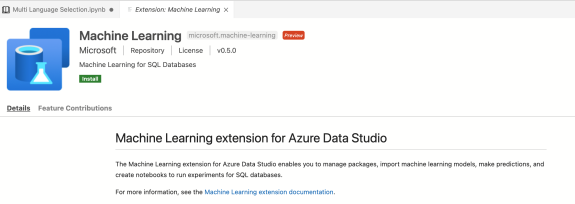
Once you have this installed, go and download the extension for Azure Data Studio – Machine Learning extension.

Once the extension is installed, under the preferences, select the setting and go to extensions, where you will find all the installed extensions on your machine. Select the machine learning extension.

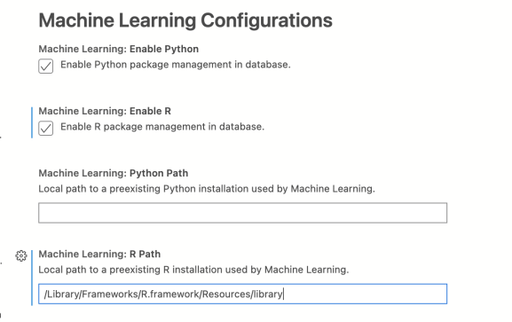
In this setting, you will have the capability to enable R and Python and configure the path to preexisting installation of both languages.

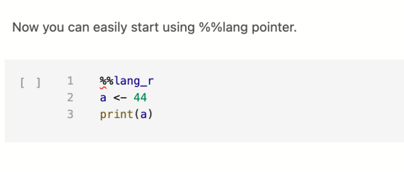
Once you have setting configures, you can easily start using the %%lang_r or %%lang_py function.

If you decide to use SQL Server kernel, you can also use the sp_execute_External_Script procedure with R, Python or Java – if you have them preinstalled.

As always, notebook is available at Github.

Happy SQL coding and stay healthy!

var vglnk = {key: '949efb41171ac6ec1bf7f206d57e90b8'}; (function(d, t) { var s = d.createElement(t); s.type = 'text/javascript'; s.async = true;// s.defer = true;// s.src = '//cdn.viglink.com/api/vglnk.js'; s.src = 'https://www.r-bloggers.com/wp-content/uploads/2020/08/vglnk.js'; var r = d.getElementsByTagName(t)[0]; r.parentNode.insertBefore(s, r); }(document, 'script'));

To leave a comment for the author, please follow the link and comment on their blog: R – TomazTsql.

R-bloggers.com offers daily e-mail updates about R news and tutorials about learning R and many other topics. Click here if you're looking to post or find an R/data-science job.
Want to share your content on R-bloggers? click here if you have a blog, or here if you don't.

The post Using multi languages Azure Data Studio Notebooks first appeared on R-bloggers.

Logistic Regression as the Smallest Possible Neural Network

$
0
0

[This article was first published on R-Bloggers – Learning Machines, and kindly contributed to R-bloggers]. (You can report issue about the content on this page here)
Want to share your content on R-bloggers? click here if you have a blog, or here if you don't.

We already covered Neural Networks and Logistic Regression in this blog.

If you want to gain an even deeper understanding of the fascinating connection between those two popular machine learning techniques read on!

Let us recap what an artificial neuron looks like:

Mathematically it is some kind of non-linear activation function of the scalar product of the input vector and the weight vector. One of the inputs the so-called bias (neuron), is fixed at 1.

The activation function can e.g. be (and often is) the logistic function (which is an example of a sigmoid function):

logistic <- function(x) 1 / (1 + exp(-x))curve(logistic, -6, 6, lwd = 3, col = "blue")abline(h = c(0, 0.5, 1), v = 0)

Written mathematically an artificial neuron performs the following function:

    \[\frac{1}{1+e^{-\vec{x} \vec{w}}}\]

Written this way that is nothing else but a logistic regression as a Generalized Linear Model (GLM) (which is basically itself nothing else but the logistic function of a simple linear regression)! More precisely it is the probability given by a binary logistic regression that the actual class is equal to 1. So, basically:

neuron = logistic regression = logistic(linear regression)

The following table translates the terms used in each domain:

Neural networkLogistic regression
Activation functionLink function
WeightsCoefficients
BiasIntercept
LearningFitting

Interestingly enough, there is also no closed-form solution for logistic regression, so the fitting is also done via a numeric optimization algorithm like gradient descent. Gradient descent is also widely used for the training of neural networks.

To illustrate this connection in practice we will again take the example from “Understanding the Magic of Neural Networks” to classify points in a plane, but this time with the logistic function and some more learning cycles. Have a look at the following table:

Input 1Input 2Output
100
001
110
011

If you plot those points with the colour coded pattern you get the following picture:

The task for the neuron is to find a separating line and thereby classify the two groups. Have a look at the following code:

# inspired by Kubat: An Introduction to Machine Learning, p. 72plot_line <- function(w, col = "blue", add = "FALSE", type = "l")  curve(-w[1] / w[2] * x - w[3] / w[2], xlim = c(-0.5, 1.5), ylim = c(-0.5, 1.5), col = col, lwd = 3, xlab = "Input 1", ylab = "Input 2", add = add, type = type)neuron <- function(input) as.vector(logistic(input %*% weights)) # logistic function on scalar product of weights and inputeta <- 0.7 # learning rate# examplesinput <- matrix(c(1, 0,                  0, 0,                  1, 1,                  0, 1), ncol = 2, byrow = TRUE)input <- cbind(input, 1) # bias for intercept of lineoutput <- c(0, 1, 0, 1)weights <- rep(0.2, 3) # random initial weightsplot_line(weights, type = "n"); grid()points(input[ , 1:2], pch = 16, col = (output + 2))# training of weights of neuronfor (i in 1:1e5) {  for (example in 1:length(output)) {    weights <- weights + eta * (output[example] - neuron(input[example, ])) * input[example, ]  }}plot_line(weights, add = TRUE, col = "black")

# test: applying neuron on inputround(apply(input, 1, neuron))## [1] 0 1 0 1

As you can see, the result matches the desired output, graphically the black line separates the green from the red points: the neuron has learned this simple classification task. Now let us do the same with logistic regression:

# logistic regression - glm stands for generalized linear modellogreg <- glm(output ~ ., data = data.frame(input, output), family = binomial) # test: prediction logreg on inputround(predict(logreg, data.frame(input), "response"), 3)## Warning in predict.lm(object, newdata, se.fit, scale = 1, type = if (type == :## prediction from a rank-deficient fit may be misleading## 1 2 3 4 ## 0 1 0 1plot_line(weights, type = "n"); grid()points(input[ , 1:2], pch = 16, col = (output + 2))plot_line(weights, add = TRUE, col = "darkgrey")plot_line(coef(logreg)[c(2:3, 1)], add = TRUE, col = "black")

Here we used the same plotting function with the coefficients of the logistic regression (instead of the weights of the neuron) as input: as you can see the black line perfectly separates both groups, even a little bit better than the neuron (in dark grey). Fiddling with the initialization, the learning rate, and the number of learning cycles should move the neuron’s line even further towards the logistic regression’s perfect solution.

I always find it fascinating to understand the hidden connections between different realms and I think this insight is especially cool: logistic regression really is the smallest possible neural network!

var vglnk = {key: '949efb41171ac6ec1bf7f206d57e90b8'}; (function(d, t) { var s = d.createElement(t); s.type = 'text/javascript'; s.async = true;// s.defer = true;// s.src = '//cdn.viglink.com/api/vglnk.js'; s.src = 'https://www.r-bloggers.com/wp-content/uploads/2020/08/vglnk.js'; var r = d.getElementsByTagName(t)[0]; r.parentNode.insertBefore(s, r); }(document, 'script'));

To leave a comment for the author, please follow the link and comment on their blog: R-Bloggers – Learning Machines.

R-bloggers.com offers daily e-mail updates about R news and tutorials about learning R and many other topics. Click here if you're looking to post or find an R/data-science job.
Want to share your content on R-bloggers? click here if you have a blog, or here if you don't.

The post Logistic Regression as the Smallest Possible Neural Network first appeared on R-bloggers.

Upcoming Why R Webinar – Clean up your data screening process with _reporteR_

$
0
0

[This article was first published on Why R? Foundation, and kindly contributed to R-bloggers]. (You can report issue about the content on this page here)
Want to share your content on R-bloggers? click here if you have a blog, or here if you don't.

On Thursday, December 3rd at 7 pm UTC, as part of the Why R? Webinar series, we have the honour to host Claus Ekstrøm and Anne Helby Petersen from the Department of Public Health at the University of Copenhagen. They will present a talk about reporteR (formerly known as dataMaid), an R package that generates friendly data overview reports for less R-savvy collaborators.

Join us!

Webinar

Check out our other events on this webinars series. To watch previous episodes check out the WhyR YouTube channel and make sure to subscribe!

Looking for more R news? Subscribe to our newsletter and stay updated on our events and the most relevant news about our beloved open source programming language.

And if you enjoy the content and would like to offer support, donate to the WhyR foundation. We are a volunteer-run non-profit organisation and appreciate your contribution to continue to fulfil our mission.

Speakers

  • Claus Ekstrøm Is a professor in biostatistics at the University of Copenhagen, Denmark. He is the creator and contributor to a number of R packages (reporteR, MESS, MethComp, SuperRanker) and is the author of “The R Primer” book. He has previously given R tutorials at useR 2016, eRum 2018, and ASAs Conference on Statistical Practice 2018, and won the C. Oswald George prize from Teaching Statistics in 2014.

  • Anne Helby Petersen is a PhD student in biostatistics at the University of Copenhagen, Denmark. She is the primary author of several R packages, including reporteR. She has taught statistics and R in numerous courses at the University of Copenhagen with students coming from a wide range of backgrounds, including science, medicine and mathematics.

Talk description

Clean up your data screening process with reporteR

Data cleaning and data validation are the first steps in practically any data analysis, as the validity of the conclusions from the analysis hinges on the quality of the input data.

Mistakes in the data can arise for any number of reasons, including erroneous codings, malfunctioning measurement equipment, and inconsistent data generation manuals. Consequently, it is essential to enable topic experts who are knowledgeable about the context and data collection procedure to partake in the data quality assessment since they will be better at identifying potential problems in the data. However, they may not have the technical skills to work with the data themselves.

The reporteR package (formerly known as dataMaid) makes it easy to produce a document that less R-savvy collaborators can read, understand and use to decide “do these data look right?” and documents which potential errors were considered. Both will help ensure subsequent reproducible data science and document the data at all stages of the quality assessment process.

The package includes both very user-friendly one-liner commands that auto-generates data overview reports, as well as a highly customizable suite of data validation and documentation tools that can be moulded to fit most data validation needs. And, perhaps most importantly, it was specifically build to make sure that documentation and validation go hand in hand, so we can clean up any unstructured messy data cleaning process.

Sponsor

This event is part of a series sponsored by Jumping Rivers. For more information, check out the JR and WhyR partnership announcement.

Jumping Rivers is an advanced analytics company whose passion is data and machine learning. Our mission is to help clients move from data storage to intelligent data insights leveraging training and setup for data operations with world-leading experts in R and Python.

We offer courses in analytics, data visualisation and programming languages. From individuals to teams, we have what is needed to upscale your skills.

Our courses go from introduction to R and Python to advanced statistical models.

Check out the course’s calendar for 2021.

Questions? Contact us directly.

Contact

Jumping RiversTwitterLinkedin

var vglnk = {key: '949efb41171ac6ec1bf7f206d57e90b8'}; (function(d, t) { var s = d.createElement(t); s.type = 'text/javascript'; s.async = true;// s.defer = true;// s.src = '//cdn.viglink.com/api/vglnk.js'; s.src = 'https://www.r-bloggers.com/wp-content/uploads/2020/08/vglnk.js'; var r = d.getElementsByTagName(t)[0]; r.parentNode.insertBefore(s, r); }(document, 'script'));

To leave a comment for the author, please follow the link and comment on their blog: Why R? Foundation.

R-bloggers.com offers daily e-mail updates about R news and tutorials about learning R and many other topics. Click here if you're looking to post or find an R/data-science job.
Want to share your content on R-bloggers? click here if you have a blog, or here if you don't.

The post Upcoming Why R Webinar - Clean up your data screening process with _reporteR_ first appeared on R-bloggers.


R, Python & Julia in Data Science: A comparison

$
0
0

[This article was first published on R-Bloggers – eoda GmbH, and kindly contributed to R-bloggers]. (You can report issue about the content on this page here)
Want to share your content on R-bloggers? click here if you have a blog, or here if you don't.

As digitalization progresses and data science interfaces continue to grow, new opportunities are constantly emerging to reach the personal analysis goals. Despite the „modernity“ of the industry, there is now a wealth of software for every need: From the design of the analysis infrastructure to the complete, decentralized evaluation through e.g. cloud computing (the outsourced evaluation of analysis scripts). Especially for companies that are just beginning to gain a foothold in the data science and analytics world, it is often difficult to select the appropriate tools and processes for their analysis workflow. But first and foremost, there is usually a central question:

„Which programming language should be used for development?“ 

Data scientists now have a selection of programming languages at their disposal. Each one has different properties. For this reason, the individual languages are also suitable for different areas. Data science languages also play a decisive role in implementing the right IT infrastructure. Based on the assessment, it will be identified which programming language is best suited for the requirements in your individual analysis scenario. In order to simplify the answer to the question posed in advance, this article briefly introduces and evaluates the current and most common languages.

Firstly, it should be noted that the evaluation of a programming language is usually dependent on the respective requirements of the application and we therefore make a very general assessment.

R & RStudio

As maintainer of the leading R development environment, package developer and provider of solutions for the professional use of R, RStudio is one of the pioneers for the distribution of R in the enterprise environment. The statistical language R was published in 1993 and was originally developed for statisticians. In the meantime, R has enjoyed great popularity among statisticians and analysts from a wide range of disciplines. As a free software and with over 14000 additional packages listed on R’s largest open source package archive CRAN, you will find the right tool for almost every application. With the free software RStudio-Server, or the commercial equivalent RStudio-Server-Pro, the developers create an intuitive user interface in which several users can work in parallel on a project basis. The results can then be conveniently published with a click of a button and thus made accessible to users of all kinds. The in-house RStudio Connect, a platform on which published results in the form of scripts, reports or applications created with R’s WebApp framework “Shiny” can be viewed and, if necessary, used interactively.

RStudio IDE


Python & Jupyter Notebook

The programming language Python, published in 1991, impresses above all with its comparatively simple and easy-to-read syntax as well as its usefulness in a wide variety of applications, from backend development to artificial intelligence and desktop applications. As time passed, Python only became important in the field of data science, when extensive tools for data processing were implemented by additional modules such as “numpy” and “pandas”. Especially in the field of machine learning, which covers processes like image recognition and language analysis, Python is the language of choice. Especially in the field of data analysis, the development environment „Jupyter Notebook“ is often used, since the documents created here can be used interactively and easily exported and distributed as static reports. The developers of Project Jupyter also provide a multi-user environment like RStudio Server for Jupyter Notebook in the form of JupyterHub. The popularity of Jupyter Notebook extends to the most popular cloud computing services like Amazon’s SageMaker, Google’s Cloud-ML-Engine and Microsoft Azure’s Machine Learning Studio.

IDE Jupyter Notebook

Accessible workflow between R & Python

As already discussed in our article about the R-package reticulate, the data scientist of today, even with an existing infrastructure, rarely has to choose one of the two languages. RStudio server and the Jupyter Notebook have integrated the necessary support for both languages. And more: Even within the languages a multilingual development is possible, so in Python in the module rpy2 the necessary interface to the R-code is found and in R in the above-mentioned reticulate package the other way round. Jupyter Notebook documents can also be published on RStudio Connect. This development is noticeably reflected in the development and maintenance of modern analysis infrastructures. Experience has shown that existing systems are often retrofitted so that both languages are supported and new systems can be set up directly with both options in mind.

Julia programming language – young, but efficient

The programming language Julia, which appeared as open source in 2012, attempts to combine the accessibility and productivity of a statistical language like R with the performance of a compiled language like C. The language is a statistical language. The language, which was developed especially for scientific computing, can also be used as a universal language. The speed of the programs is in the range of C and thus clearly distinguishes itself from R and Python, which is why Julia is increasingly establishing itself on the market. Since only an official version 1.0 was released by the developers in 2018, it remains to be seen to what extent Julia will be able to assert itself in the coming years. Especially in view of the numerous case studies which are listed on the official Julia website, we are optimistic for the future of Julia in the context of alternative programming languages.

Which programming is suitable for what?

In conclusion, the question of the right programming language is not getting easier to answer due to the blurring of boundaries between languages, but it is becoming more and more obscure, which we think is a good development. Nevertheless, to provide a „final“ assessment, we recommend R for applications that place a high value on data visualization (ggplot2) and/or can take advantage of the powerful shiny framework in combination with the RStudio products. For applications such as image recognition and natural language processing (speech analysis), we recommend Python (scikit, pandas). As mentioned above, Python is particularly well suited for cloud computing. An example of this is the connection to Amazon’s Machine Learning Service „SageMaker“. Nevertheless, R and Python are both suitable for data manipulation. The advantages of Julia are above all its speed. Julia is therefore often used for time-critical or resource-intensive applications. An overview of a selection of recommended applications can be seen on the right.

You could already identify which programming language is needed? We are happy to train you in the languages R, Python or Julia. We offer all training courses as remote and in-house trainings. These can also be individually adapted to your requirements and held in English. 

var vglnk = {key: '949efb41171ac6ec1bf7f206d57e90b8'}; (function(d, t) { var s = d.createElement(t); s.type = 'text/javascript'; s.async = true;// s.defer = true;// s.src = '//cdn.viglink.com/api/vglnk.js'; s.src = 'https://www.r-bloggers.com/wp-content/uploads/2020/08/vglnk.js'; var r = d.getElementsByTagName(t)[0]; r.parentNode.insertBefore(s, r); }(document, 'script'));

To leave a comment for the author, please follow the link and comment on their blog: R-Bloggers – eoda GmbH.

R-bloggers.com offers daily e-mail updates about R news and tutorials about learning R and many other topics. Click here if you're looking to post or find an R/data-science job.
Want to share your content on R-bloggers? click here if you have a blog, or here if you don't.

The post R, Python & Julia in Data Science: A comparison first appeared on R-bloggers.

JavaScript for R — ebook

$
0
0

[This article was first published on r – paulvanderlaken.com, and kindly contributed to R-bloggers]. (You can report issue about the content on this page here)
Want to share your content on R-bloggers? click here if you have a blog, or here if you don't.

The R programming language has seen the integration of many languages; C, C++, Python, to name a few, can be seamlessly embedded into R so one can conveniently call code written in other languages from the R console. Little known to many, R works just as well with JavaScript—this book delves into the various ways both languages can work together.

https://book.javascript-for-r.com/

John Coene is an well-known R and JavaScript developer. He recently wrote a book on JavaScript for R users, of which he published an online version free to access here.

The book is definitely worth your while if you want to better learn how to develop front-end applications (in JavaScript) on top of your statistical R programs. Think of better understanding, and building, yourself Shiny modules or advanced data visualizations integrated right into webpages.

A nice step on your development path towards becoming a full stack developer by combining R and JavaScript!

Yet most R developers are not familiar with one of web browsers’ core technology: JavaScript. This book aims to remedy that by revealing how much JavaScript can greatly enhance various stages of data science pipelines from the analysis to the communication of results.

https://book.javascript-for-r.com/

Want to learn more about JavaScript in general, then I recommend this book:

var vglnk = {key: '949efb41171ac6ec1bf7f206d57e90b8'}; (function(d, t) { var s = d.createElement(t); s.type = 'text/javascript'; s.async = true;// s.defer = true;// s.src = '//cdn.viglink.com/api/vglnk.js'; s.src = 'https://www.r-bloggers.com/wp-content/uploads/2020/08/vglnk.js'; var r = d.getElementsByTagName(t)[0]; r.parentNode.insertBefore(s, r); }(document, 'script'));

To leave a comment for the author, please follow the link and comment on their blog: r – paulvanderlaken.com.

R-bloggers.com offers daily e-mail updates about R news and tutorials about learning R and many other topics. Click here if you're looking to post or find an R/data-science job.
Want to share your content on R-bloggers? click here if you have a blog, or here if you don't.

The post JavaScript for R — ebook first appeared on R-bloggers.

What Can I Do With R? 6 Essential R Packages for Programmers

$
0
0

[This article was first published on r – Appsilon | End­ to­ End Data Science Solutions, and kindly contributed to R-bloggers]. (You can report issue about the content on this page here)
Want to share your content on R-bloggers? click here if you have a blog, or here if you don't.

R for Programmers Thumbnail

R is a programming language created by Ross Ihaka and Robert Gentleman in 1993. It was designed for analytics, statistics, and data visualizations. Nowadays, R can handle anything from basic programming to machine learning and deep learning. Today we will explore how to approach learning and practicing R for programmers.

As mentioned before, R can do almost anything. It performs the best when applied to anything data related – such as statistics, data science, and machine learning.

The language is most widely used in academia, but many large companies such as Google, Facebook, Uber, and Airbnb use it daily.

Today you’ll learn how to:

Load datasets

To perform any sort of analysis, you first have to load in the data. With R, you can connect to any data source you can imagine. A simple Google search will yield either a premade library or an example of API calls for any data source type.

For a simple demonstration, we’ll see how to load in CSV data. You can find the Iris dataset in CSV format on this link, so please download it to your machine. Here’s how to load it in R:

iris <- read.csv("iris.csv")head(iris)

And here’s what the head function outputs – the first six rows:

Image 1 - Iris dataset head

Image 1 – Iris dataset head

Did you know there’s no need to download the dataset? You can load it from the web:

iris <- read.csv("https://gist.githubusercontent.com/netj/8836201/raw/6f9306ad21398ea43cba4f7d537619d0e07d5ae3/iris.csv")head(iris)

That’s all great, but what if you can’t find an appropriate dataset? That’s where web scraping comes into play.

Web scraping

A good dataset is difficult to find, so sometimes you have to be creative. Web scraping is considered as one of the more “creative” ways of collecting data, as long as you don’t cross any legal boundaries. 

In R, the rvest package is used for the task. As some websites have strict policies against scraping, we need to be extra careful. There are pages online designed for practicing web scraping, so that’s good news for us. We will scrape this page and retrieve book titles in a single category:

library(rvest)url <- "http://books.toscrape.com/catalogue/category/books/travel_2/index.html"titles <- read_html(url) %>%  html_nodes("h3") %>%  html_nodes("a") %>%  html_text()

The titles variable contains the following elements:

Image 2 - Web Scraping example in R

Image 2 – Web Scraping example in R

Yes – it’s that easy. Just don’t cross any boundaries. Check if a website has a public API first – if so, there’s no need for scraping. If not, check their policies.

Build REST APIs

With practical machine learning comes the issue of model deployment. Currently, the best option is to wrap the predictive functionality of a model into a REST API. Showing how to do that effectively would require at least an article or two, so we will cover the basics today.

In R, the plumber package is used to build REST APIs. Here’s the one that comes in by default when you create a plumber project:

library(plumber)#* @apiTitle Plumber Example API#* Echo back the input#* @param msg The message to echo#* @get /echofunction(msg = "") {    list(msg = paste0("The message is: '", msg, "'"))}#* Plot a histogram#* @png#* @get /plotfunction() {    rand <- rnorm(100)    hist(rand)}#* Return the sum of two numbers#* @param a The first number to add#* @param b The second number to add#* @post /sumfunction(a, b) {    as.numeric(a) + as.numeric(b)}

The API has three endpoints:

  1. /echo– returns a specified message in the response 
  2. /plot– shows a histogram of 100 random normally distributed numbers
  3. /sum– sums two numbers

The plumber package comes with Swagger UI, so you can explore and test your API in the web browser. Let’s take a look:

Image 3 - Plumber REST API Showcase

Image 3 – Plumber REST API Showcase

Statistics and Data Analysis

This is one of the biggest reasons why R is so popular. There are entire books and courses on this topic, so we will only go over the basics. We intend to cover more advanced concepts in the following articles, so stay tuned to our blog if that interests you.

Most of the data manipulation in R is done with the dplyr package. Still, we need a dataset to manipulate with – Gapminder will do the trick. It is available in R through the gapminder package. Here’s how to load both libraries and explore the first couple of rows:

library(dplyr)library(gapminder)head(gapminder)

You should see the following in the console:

Image 4 - Head of Gapminder dataset

Image 4 – Head of Gapminder dataset

To perform any kind of statistical analysis, you could use R’s built-in functions such as min, max, range, mean, median, quantile, IQR, sd, and var. These are great if you need something specific, but a simple call to the summary function will provide you enough information, most likely:

summary(gapminder)

Here’s a statistical summary of the Gapminder dataset:

Image 5 - Statistical summary of the Gapminder dataset

Image 5 – Statistical summary of the Gapminder dataset

With dplyr, you can drill down and keep only the data of interest. Let’s see how to show only data for Poland and how to calculate total GDP:

gapminder %>%  filter(continent == "Europe", country == "Poland") %>%  mutate(TotalGDP = pop * gdpPercap)

The corresponding results are shown in the console:

Image 6 - History data and total GDP for Poland

Image 6 – History data and total GDP for Poland

Data Visualization

R is known for its impeccable data visualization capabilities. The ggplot2 package is a good starting point because it’s easy to use and looks great by default. We’ll use it to make a couple of basic visualizations on the Gapminder dataset.

To start, we will create a line chart comparing the total population in Poland over time. We will need to filter out the dataset first, so it only shows data for Poland. Below you’ll find a code snippet for library imports, dataset filtering, and data visualization:

library(dplyr)library(gapminder)library(scales)library(ggplot2)poland <- gapminder %>%  filter(continent == "Europe", country == "Poland")ggplot(poland, aes(x = year, y = pop)) +  geom_line(size = 2, color = "#0099f9") +  ggtitle("Poland population over time") +  xlab("Year") +  ylab("Population") +  expand_limits(y = c(10^6 * 25, NA)) +  scale_y_continuous(    labels = paste0(c(25, 30, 35, 40), "M"),    breaks = 10^6 * c(25, 30, 35, 40)  ) +  theme_bw()

Here is the corresponding output:

Image 7 - Poland population over time

Image 7 – Poland population over time

You can get a similar visualization with the first two code lines – the others are added for styling.

The ggplot2 package can display almost any data visualization type, so let’s explore bar charts next. We want to visualize the average life expectancy over European countries in 2007. Here is the code snippet for dataset filtering and visualization:

europe_2007 <- gapminder %>%  filter(continent == "Europe", year == 2007)ggplot(europe_2007, aes(x = reorder(country, -lifeExp), y = lifeExp)) +  geom_bar(stat = "identity", fill = "#0099f9") +  geom_text(aes(label = lifeExp), color = "white", hjust = 1.3) +  ggtitle("Average life expectancy in Europe countries in 2007") +  xlab("Country") +  ylab("Life expectancy (years)") +  coord_flip() +  theme_bw()

Here’s how the chart looks like:

Image 8 - Average life expectancy in European countries in 2007

Image 8 – Average life expectancy in European countries in 2007

Once again, the first two code lines for the visualization will produce similar output. The rest are here to make it look better.

Training a Machine Learning Model

Yet another area that R handles with ease. The rpart package is great for machine learning, and we will use it to make a classifier for the well-known Iris dataset. The dataset is built into R, so you don’t have to worry about loading it manually. The caTools is used for train/test split.

Here’s how to load in the libraries, perform the train/test split, fit and visualize the model:

library(caTools)library(rpart)library(rpart.plot)set.seed(42)sample <- sample.split(iris, SplitRatio = 0.75)iris_train = subset(iris, sample == TRUE)iris_test = subset(iris, sample == FALSE)model <- rpart(Species ~., data = iris_train, method = "class")rpart.plot(model)

The snippet shouldn’t take more than a second or two to execute. Once done, you’ll be presented with the following visualization:

Image 9 - Decision tree visualization for Iris dataset

Image 9 – Decision tree visualization for Iris dataset

The above figure tells you everything about the decision-making process of the algorithm. We can now evaluate the model on previously unseen data (test set). Here’s how to make predictions, print confusion matrix, and accuracy:

preds <- predict(model, iris_test, type = "class")confusion_matrix <- table(iris_test$Species, preds)print(confusion_matrix)accuracy <- sum(diag(confusion_matrix)) / sum(confusion_matrix)print(accuracy)
Image 10 - Confusion matrix and accuracy on the test subset

Image 10 – Confusion matrix and accuracy on the test subset

As you can see, we got a 95% accurate model with only a couple of lines of code. 

Develop Simple Web Applications

At Appsilon, we are global leaders in R Shiny, and we’ve developed some of the world’s most advanced R Shiny dashboards. It is a go-to package for developing web applications.

For the web app example, we’ll see how to make simple interactive dashboards that displays a scatter plot of the two user-specified columns. The dataset of choice is also built into R – mtcars.

Here is a script for the Shiny app:

library(shiny)library(ggplot2)ui <- fluidPage(  sidebarPanel(    width = 3,    tags$h4("Select"),    varSelectInput(      inputId = "x_select",      label = "X-Axis",      data = mtcars    ),    varSelectInput(      inputId = "y_select",      label = "Y-Axis",      data = mtcars    )  ),  mainPanel(    plotOutput(outputId = "scatter")  ))server <- function(input, output) {  output$scatter <- renderPlot({    col1 <- sym(input$x_select)    col2 <- sym(input$y_select)    ggplot(mtcars, aes(x = !!col1, y = !!col2)) +      geom_point(size = 6, color = "#0099f9") +      ggtitle("MTCars Dataset Explorer") +      theme_bw()  })}shinyApp(ui = ui, server = server)

And here’s the corresponding Shiny app:

Image 11 - MTCars Shiny app

Image 11 – MTCars Shiny app

This dashboard is as simple as they come, but that doesn’t mean you can’t develop beautiful-looking apps with Shiny.

Looking for inspiration? Take a look at our Shiny App Demo Gallery.

Conclusion

To conclude – R can do almost anything that a general-purpose programming language can do. The question isn’t “Can R do it”, but instead “Is R the right tool for the job”. If you are working on anything data-related, then yes, R can do it and is a perfect candidate for the job.

If you don’t intend to work with data in any way, shape, or form, R might not be the optimal tool. Sure, R can do almost anything, but some tasks are much easier to do in Python or Java.

Want to learn more about R? Start here:

Appsilon is hiring globally! We are primarily seeking an Engineering Manager who can lead a team of 6-8 software engineers. See our Careers page for all new openings, including openings for a Project Manager and Community Manager.

Article What Can I Do With R? 6 Essential R Packages for Programmers comes from Appsilon | End­ to­ End Data Science Solutions.

var vglnk = {key: '949efb41171ac6ec1bf7f206d57e90b8'}; (function(d, t) { var s = d.createElement(t); s.type = 'text/javascript'; s.async = true;// s.defer = true;// s.src = '//cdn.viglink.com/api/vglnk.js'; s.src = 'https://www.r-bloggers.com/wp-content/uploads/2020/08/vglnk.js'; var r = d.getElementsByTagName(t)[0]; r.parentNode.insertBefore(s, r); }(document, 'script'));

To leave a comment for the author, please follow the link and comment on their blog: r – Appsilon | End­ to­ End Data Science Solutions.

R-bloggers.com offers daily e-mail updates about R news and tutorials about learning R and many other topics. Click here if you're looking to post or find an R/data-science job.
Want to share your content on R-bloggers? click here if you have a blog, or here if you don't.

The post What Can I Do With R? 6 Essential R Packages for Programmers first appeared on R-bloggers.

Advent of 2020, Day 1 – What is Azure DataBricks

$
0
0

[This article was first published on R – TomazTsql, and kindly contributed to R-bloggers]. (You can report issue about the content on this page here)
Want to share your content on R-bloggers? click here if you have a blog, or here if you don't.

Azure Databricks is a data analytics platform (PaaS), specially optimised for Microsoft Azure cloud platform. Databricks is an enterprise-grade platform service that is unified for data lake architecture for large analytical operations.

Azure Databricks: End-to-end web-based analytics platform

Azure Databricks combines:

  • large scale data processing for batch loads and streaming data
  • simplifies and accelerates collaborative work among data scientists, data engineers and machine learning engineers
  • offers complete analytics and machine learning algorithms and languages
  • features complete ML DevOps model life-cycle; from experimentation to production
  • is build on Apache Spark and embraces Delta Lake and ML Flow

Azure Databricks is optimized for the Microsoft Azure and offeres interactive workspace for collaboration between data engineers, data scientists, and machine learning engineers. With the multi language capabilities to create notebooks in Python, R, Scala, Spark, SQL and others.

It gives you the capabilities also to run SQL queries on data lake, create multiple visualisation types to explore query results from different perspectives, and build and share dashboards.

Azure Databricks is designed to build and handle big data pipeline, for data ingestion (raw or structured) into Azure through several different Azure services as:

  • Azure Data Factory in batches,
  • or streamed near real-time using Apache Kafka,
  • Event Hub, or
  • IoT Hub.

If supports also connectivity so several persisted storages for creating data lake, like:

  • Azure Blob Storage
  • Azure Data Lage Storage
  • SQL-type databases
  • Queue / File-tables

Your analytics workflow will be using Spark technology to read data from multiple different sources, and create state of the art analytics in Azure Databricks.

Welcome page to Azure Databricks gives you easy, fast and collaborative interface.

Complete set of code and Notebooks will be available at the Github repository.

Happy Coding and Stay Healthy!

var vglnk = {key: '949efb41171ac6ec1bf7f206d57e90b8'}; (function(d, t) { var s = d.createElement(t); s.type = 'text/javascript'; s.async = true;// s.defer = true;// s.src = '//cdn.viglink.com/api/vglnk.js'; s.src = 'https://www.r-bloggers.com/wp-content/uploads/2020/08/vglnk.js'; var r = d.getElementsByTagName(t)[0]; r.parentNode.insertBefore(s, r); }(document, 'script'));

To leave a comment for the author, please follow the link and comment on their blog: R – TomazTsql.

R-bloggers.com offers daily e-mail updates about R news and tutorials about learning R and many other topics. Click here if you're looking to post or find an R/data-science job.
Want to share your content on R-bloggers? click here if you have a blog, or here if you don't.

The post Advent of 2020, Day 1 – What is Azure DataBricks first appeared on R-bloggers.

Tools for colors and palettes: colorspace 2.0-0, web page, and JSS paper

$
0
0

[This article was first published on Achim Zeileis, and kindly contributed to R-bloggers]. (You can report issue about the content on this page here)
Want to share your content on R-bloggers? click here if you have a blog, or here if you don't.

Version 2.0-0 of the R package ‘colorspace’ with tools for manipulating and assessing colors and palettes is now available from CRAN, accompanied by an updated web page, and a paper in the Journal of Statistical Software (JSS).

Overview

colorspace logo

The R package colorspace provides a flexible toolbox for selecting individual colors or color palettes, manipulating these colors, and employing them in statistical graphics and data visualizations. In particular, the package provides a broad range of color palettes based on the HCL (hue-chroma-luminance) color space. The three HCL dimensions have been shown to match those of the human visual system very well, thus facilitating intuitive selection of color palettes through trajectories in this space. Using the HCL color model, general strategies for three types of palettes are implemented: (1) Qualitative for coding categorical information, i.e., where no particular ordering of categories is available. (2) Sequential for coding ordered/numeric information, i.e., going from high to low (or vice versa). (3) Diverging for coding ordered/numeric information around a central neutral value, i.e., where colors diverge from neutral to two extremes. To aid selection and application of these palettes, the package also contains scales for use with ggplot2, shiny and tcltk apps for interactive exploration, visualizations of palette properties, accompanying manipulation utilities (like desaturation and lighten/darken), and emulation of color vision deficiencies.

JSS paper

Zeileis A, Fisher JC, Hornik K, Ihaka R, McWhite CD, Murrell P, Stauffer R, Wilke CO (2020). “colorspace: A Toolbox for Manipulating and Assessing Colors and Palettes.” Journal of Statistical Software, 96(1), 1-49. doi:10.18637/jss.v096.i01.

CRAN release of version 2.0-0

The release of version 2.0-0 on CRAN (Comprehensive R Archive Network) concludes more than a decade of development and substantial updates since the release of version 1.0-0. The JSS paper above gives a detailed overview of the package’s features. The full list of changes over the different release is provided in the package’s NEWS.

Web page

Even more details and links along with the full software manual are available on the package web page on R-Forge at http://colorspace.R-Forge.R-project.org/ (produced with pkgdown).

var vglnk = {key: '949efb41171ac6ec1bf7f206d57e90b8'}; (function(d, t) { var s = d.createElement(t); s.type = 'text/javascript'; s.async = true;// s.defer = true;// s.src = '//cdn.viglink.com/api/vglnk.js'; s.src = 'https://www.r-bloggers.com/wp-content/uploads/2020/08/vglnk.js'; var r = d.getElementsByTagName(t)[0]; r.parentNode.insertBefore(s, r); }(document, 'script'));

To leave a comment for the author, please follow the link and comment on their blog: Achim Zeileis.

R-bloggers.com offers daily e-mail updates about R news and tutorials about learning R and many other topics. Click here if you're looking to post or find an R/data-science job.
Want to share your content on R-bloggers? click here if you have a blog, or here if you don't.

The post Tools for colors and palettes: colorspace 2.0-0, web page, and JSS paper first appeared on R-bloggers.

around the table

$
0
0

[This article was first published on R – Xi'an's Og, and kindly contributed to R-bloggers]. (You can report issue about the content on this page here)
Want to share your content on R-bloggers? click here if you have a blog, or here if you don't.

Monty Python and the Holy Grail: the round table in CamelotThe Riddler has a variant on the classical (discrete) random walk around a circle where every state (but the starting point) has the same probability 1/(n-1) to be visited last. Surprising result that stems almost immediately from the property that, leaving from 0, state a is visited couterclockwise before state b>a is visited clockwise is b/a+b. The variant includes (or seems to include) the starting state 0 as counting for the last visit (as a return to the origin). In that case, all n states, including the origin, but the two neighbours of 0, 1, and n-1, have the same probability to be last. This can also be seen on an R code that approximates (inner loop) the probability that a given state is last visited and record how often this probability is largest (outer loop):

w=0*(1:N)#frequency of most likely lastfor(t in 1:1e6){ o=0*w#probabilities of being last for(v in 1:1e6)#sample order of visits   o[i]=o[i<-1+unique(cumsum(sample(c(-1,1),300,rep=T))%%N)[N]]+1 w[j]=w[j<-order(o)[N]]+1}

However, upon (jogging) reflection, the double loop is a waste of energy and

o=0*(1:N)for(v in 1:1e8)   o[i]=o[i<-1+unique(cumsum(sample(c(-1,1),500,rep=T))%%N)[N]]+1

should be enough to check that all n positions but both neighbours have the same probability of being last visited. Removing the remaining loop should be feasible by considering all subchains starting at one of the 0’s, since this is a renewal state, but I cannot fathom how to code it succinctly. A more detailed coverage of the original problem (that is, omitting the starting point) was published the Monday after publication of the riddle on R bloggers, following a blog post by David Robinson on Variance Explained.

var vglnk = {key: '949efb41171ac6ec1bf7f206d57e90b8'}; (function(d, t) { var s = d.createElement(t); s.type = 'text/javascript'; s.async = true;// s.defer = true;// s.src = '//cdn.viglink.com/api/vglnk.js'; s.src = 'https://www.r-bloggers.com/wp-content/uploads/2020/08/vglnk.js'; var r = d.getElementsByTagName(t)[0]; r.parentNode.insertBefore(s, r); }(document, 'script'));

To leave a comment for the author, please follow the link and comment on their blog: R – Xi'an's Og.

R-bloggers.com offers daily e-mail updates about R news and tutorials about learning R and many other topics. Click here if you're looking to post or find an R/data-science job.
Want to share your content on R-bloggers? click here if you have a blog, or here if you don't.

The post around the table first appeared on R-bloggers.

RStudio v1.4 Preview: The Little Things

$
0
0

[This article was first published on RStudio Blog, and kindly contributed to R-bloggers]. (You can report issue about the content on this page here)
Want to share your content on R-bloggers? click here if you have a blog, or here if you don't.

This post is part of a series on new features in RStudio 1.4, currently available as a preview release.

Today, we continue a longstandingtradition of concluding our preview blog series with a look at some of the smaller features we’ve added to the IDE.

Deeper Outlines for R Scripts

If you write R scripts longer than a couple of pages, you probably already use RStudio’s document outline pane, which makes it easy to see an overview of your R script and navigate quickly to any section. To make it easier to navigate in longer and more nested scripts, we’ve added support for subsections in the outline.

Screenshot of the Document Outline showing nested R Script sections

Add subsections to your code by using Markdown-style comment headers, with the label followed by four or more dashes. For example:

# Section ----## Subsection ----### Sub-subsection ----

More information on code sections can be found on our help site: Code Folding and Sections.

History Navigation with the Mouse

If you have a mouse with side buttons, you can now use them to jump backwards and forwards through your source history (recent editing locations).

A computer mouse with side buttons corresponding to forward/back navigation toolbar buttons

Render Plots with AGG

AGG (Anti-Grain Geometry) is a high-performance, high-quality 2D drawing library. RStudio 1.4 integrates with a new AGG-powered graphics device provided by the ragg R package to render plots and other graphical output from R. It’s faster than the one built into R, and it does a better job of rendering fonts and anti-aliasing. Its output also is very consistent, no matter where you run your R code.

Sample plot generated with the ragg graphics device

To start using this new device, go to Options -> General -> Graphics -> Backend and select “AGG”.

Pane Focus and Navigation

If you primarily use the keyboard to navigate the IDE, we’ve introduced a couple of new tools that will make it easier to move around. Check Options -> Accessibility -> Highlight Focused Panel and RStudio will draw a subtle dotted border around the part of the IDE that has focus. For example, when your cursor is in the Console panel:

The RStudio IDE with the Console tab outlined

We’ve also added a new keyboard shortcut, F6, which moves focus to the next panel. Using these together makes it much easier to move through the IDE without the mouse!

Natural Sorting in Files Pane

Do you find yourself giving your R scripts names like step_001.R so that they are sorted correctly in the Files pane? It’s no longer necessary: RStudio 1.4 uses natural sort order instead of alphabetical sort order for the Files pane, so that step10.R comes after step9.R, not after step1.R.

The Files Pane with a set of R scripts sorted by filename

(See also Jenny Bryan’s advice on naming things.)

Show Grouping Information in Notebooks

Grouping data is a very useful operation, but it isn’t always obvious how data has been grouped. R Notebooks now show you information about grouping when displaying data:

The mtcars dataset with grouping information

Custom Fonts on RStudio Server

RStudio Desktop can use any font you have installed on your system, but if you use RStudio Server you’ve always been stuck with the default. No longer! RStudio Server can now use popular coding fonts like Fira Code, Source Code Pro, and JetBrains Mono.

RStudio Server's Appearances pane showing font choices

These fonts can even be installed on the server itself so it isn’t necessary to have them installed on the Web browser you use to access RStudio Server.

You can try out all these features by installing the RStudio 1.4 Preview Release. If you do, we welcome your feedback on the community forum. We look forward to getting a stable release of RStudio 1.4 in your hands soon!

var vglnk = {key: '949efb41171ac6ec1bf7f206d57e90b8'}; (function(d, t) { var s = d.createElement(t); s.type = 'text/javascript'; s.async = true;// s.defer = true;// s.src = '//cdn.viglink.com/api/vglnk.js'; s.src = 'https://www.r-bloggers.com/wp-content/uploads/2020/08/vglnk.js'; var r = d.getElementsByTagName(t)[0]; r.parentNode.insertBefore(s, r); }(document, 'script'));

To leave a comment for the author, please follow the link and comment on their blog: RStudio Blog.

R-bloggers.com offers daily e-mail updates about R news and tutorials about learning R and many other topics. Click here if you're looking to post or find an R/data-science job.
Want to share your content on R-bloggers? click here if you have a blog, or here if you don't.

The post RStudio v1.4 Preview: The Little Things first appeared on R-bloggers.


Learn and Teach R

$
0
0

[This article was first published on R Views, and kindly contributed to R-bloggers]. (You can report issue about the content on this page here)
Want to share your content on R-bloggers? click here if you have a blog, or here if you don't.

If you haven’t explored the RStudio website in a while, your next visit may include a pleasant surprise. I recently went to the Tidymodels page, just to see what was new and was immediately drawn into the new landscape imagined by the RStudio education team. Clicking on Get Started I came to a fork and a choice of going farther with Tidymodels or backing up a bit. I went down the beginners path Finding Your Way to R and found myself in a well-lit wood, and I was not lost.

Like a park with well-marked trails, the Learning R section of the RStudio Education site branches off to R excursions graded to match the “hikers” experience. The Beginners trail starts in a safe place that should make even the absolutely terrified feel comfortable. It offers different modes of learning including videos, tutorials, books and even excursions to trusted third party sites that have their own feel.

The Intermediates section emphasizes learning how to get help, suggests some basic tools that should be useful no matter what path you select, and then points to places where you may already know you want to go: bioconductor, financial models or Spark clusters for example. The basic idea is that at this stage you know enough R to get some real work done, and a good path to making further progress might be to follow what interests you.

The Experts trail is for the intrepid who are ready to venture past terra firma and take a deep dive

into the foundations of R, or package building, or using Python, or exploring deep learning with Tensorflow. As with the others, this trail is well marked and offers tools and suggestions for making progress.

Perhaps the most pleasant surprise for an educator coming to the RStudio Education site is to see that the trails don’t stop with Expert. There is an entire section of the “park” marked off for teaching with trails that offer essential material for supporting both educators and online education. Learn to teach offers advice on how to develop as a teacher based on practical experience with the Carpentries. The section on Materials for teaching offers a panpoply of courses and workshops developed at RStudio that teachers can freely adapt to their needs. There is material here relevant to data wrangling, data science, R, tidyverse, shiny and more. The third section, Tools for teaching describes RStudio Cloud and other RStudio tools for creating a modern, interactive teaching infrastructure.

Whether you are just thinking about learning R or about to teach an advanced course, I think you might enjoy walking around the RStudio Education website. Maybe, I’ll get to Tidymodels next time.

_____='https://rviews.rstudio.com/2020/12/02/learn-and-teach-r/'; var vglnk = {key: '949efb41171ac6ec1bf7f206d57e90b8'}; (function(d, t) { var s = d.createElement(t); s.type = 'text/javascript'; s.async = true;// s.defer = true;// s.src = '//cdn.viglink.com/api/vglnk.js'; s.src = 'https://www.r-bloggers.com/wp-content/uploads/2020/08/vglnk.js'; var r = d.getElementsByTagName(t)[0]; r.parentNode.insertBefore(s, r); }(document, 'script'));

To leave a comment for the author, please follow the link and comment on their blog: R Views.

R-bloggers.com offers daily e-mail updates about R news and tutorials about learning R and many other topics. Click here if you're looking to post or find an R/data-science job.
Want to share your content on R-bloggers? click here if you have a blog, or here if you don't.

The post Learn and Teach R first appeared on R-bloggers.

Advent of 2020, Day 2 – How to get started with Azure Databricks

$
0
0

[This article was first published on R – TomazTsql, and kindly contributed to R-bloggers]. (You can report issue about the content on this page here)
Want to share your content on R-bloggers? click here if you have a blog, or here if you don't.

Series of Azure Databricks posts:

In previous blogpost we have looked into what Azure Databricks and its’ main features, who is the targeted user, and what are the capabilities of the platform. Where and how to get started?

1.Get Azure subscription

If you don’t have the subscription yet, get one today at the Azure web site. It is totally free and you can get either 12 months of free subscription (for popular free services – complete list is available on the link) or get credit for $200 USD to fully explore Azure for 30-days. For using Azure Databricks, the latter will be the one.

2.Create the Azure Databricks service

Once logged in to your Azure portal, you will be directly directed to Azure dashboard, which is your UI into Azure Cloud service. In the search box type “Azure Databrick” or select it, if is recommended to you.

After selection, you will get the dialog window to select and insert the:

  • your Azure subscription
  • Create the name of Azure Databricks Workspace
  • Resource group
  • Pricing Tier and
  • Region

Once you have done the most important thing, you are left with selection of detailed network, Tags and you are finished.

After this, you can check your Databrick services:

And select the newly created Azure Databrick Service to get the overview page:

And just Launch the Workspace!

As always, the code and notebooks is available at Github repository.

Stay Healthy! See you tomorrow.

var vglnk = {key: '949efb41171ac6ec1bf7f206d57e90b8'}; (function(d, t) { var s = d.createElement(t); s.type = 'text/javascript'; s.async = true;// s.defer = true;// s.src = '//cdn.viglink.com/api/vglnk.js'; s.src = 'https://www.r-bloggers.com/wp-content/uploads/2020/08/vglnk.js'; var r = d.getElementsByTagName(t)[0]; r.parentNode.insertBefore(s, r); }(document, 'script'));

To leave a comment for the author, please follow the link and comment on their blog: R – TomazTsql.

R-bloggers.com offers daily e-mail updates about R news and tutorials about learning R and many other topics. Click here if you're looking to post or find an R/data-science job.
Want to share your content on R-bloggers? click here if you have a blog, or here if you don't.

The post Advent of 2020, Day 2 – How to get started with Azure Databricks first appeared on R-bloggers.

Forecasting Tax Revenue with Error Correction Models

$
0
0

[This article was first published on R, Econometrics, High Performance, and kindly contributed to R-bloggers]. (You can report issue about the content on this page here)
Want to share your content on R-bloggers? click here if you have a blog, or here if you don't.

There are several ways to forecast tax revenue. The IMF Financial Programming Manual reviews 3 of them: (i) the effective tax rate approach; (ii) the elasticity approach; and (iii) the regression approach. Approach (iii) typically results in the most accurate short-term forecasts. The simple regression approach regresses tax revenue on its own lags and GDP with some lags.

In the absence of large abrupt shifts in the tax base, domestic revenue can be assumed to have a linear relationship with GDP. Since however both revenue and GDP are typically non-stationary series, this relationship often takes the form of cointegration. The correct way to deal with cointegrated variables is to specify and Error Correction Model (ECM). This blog post will briefly demonstrate the specification of an ECM to forecast the tax revenue of a developing economy1. First we examine the data, which is in local currency and was transformed using the natural logarithm.

library(haven)      # Import from STATAlibrary(collapse)   # Data transformationlibrary(magrittr)   # Pipe operators %>% library(tseries)    # Time series testslibrary(lmtest)     # Linear model testslibrary(sandwich)   # Robust standard errorslibrary(dynlm)      # Dynamic linear modelslibrary(jtools)     # Enhanced regression summarylibrary(xts)        # Extensible time-series + pretty plots# Loading the data from STATAdata <- read_dta("data.dta") %>% as_factor# Generating a date variablesettfm(data, Date = as.Date(paste(Year, unattrib(Quarter) * 3L, "1", sep = "/")))# Creating time series matrix XX <- data %$% xts(cbind(lrev, lgdp), order.by = Date, frequency = 4L)# (Optional) seasonal adjustment using X-13 ARIMA SEATS  # library(seasonal)  # X <- dapply(X, function(x) predict(seas(ts(x, start = c(1997L, 3L), frequency = 4L))))  # # X <- X["2015/", ] # Optionally restricting the sample to after 2014# Plotting the raw dataplot(na_omit(X)[-1L, ] %>% setColnames(.c(Revenue, GDP)),      multi.panel = TRUE, yaxis.same = FALSE,      main = "Domestic Revenue and GDP (in Logs)",      major.ticks = "years", grid.ticks.on = "years")

# Plotting the log-differenced dataplot(na_omit(D(X)), legend.loc = "topleft",      main = "Revenue and GDP in Quarterly Log-Differences",     major.ticks = "years", grid.ticks.on = "years")

The data was not seasonally adjusted as revenue and GDP exhibit similar seasonal patterns. Summarizing the log-differenced using a function designed for panel data allows us to assess the extent of seasonality relative to overall variation.

# Summarize between and within quarterstfmv(data, 3:4, D) %>% qsu(pid = lrev + lgdp ~ Quarter)## , , lrev## ##            N/T    Mean      SD      Min     Max## Overall     91  0.0316  0.1545  -0.5456  0.6351## Between      4  0.0302  0.1275  -0.0997  0.1428## Within   22.75  0.0316  0.1077  -0.4144  0.5239## ## , , lgdp## ##            N/T    Mean      SD      Min     Max## Overall     45  0.0271   0.183  -0.3702  0.5888## Between      4  0.0291  0.0767  -0.0593  0.1208## Within   11.25  0.0271    0.17  -0.3771  0.4951

For log revenue, the standard deviation between quarters is actually slightly higher than the within-quarter standard deviation, indicating a strong seasonal component. The summary also shows that we have 23 years of quarterly revenue data but only 11 years of quarterly GDP data.

An ECM is only well specified if both series are integrated of the same order and cointegrated. This requires a battery of tests to examine the properties of the data before specifying a model2. For simplicity I will follow the 2-Step approach of Engele & Granger here, although I note that the more sophisticated Johannsen procedure is available in the urca package.

# Testing log-transformed series for stationarity: Revenue is clearly non-stationaryadf.test(X[, "lrev"])## ##  Augmented Dickey-Fuller Test## ## data:  X[, "lrev"]## Dickey-Fuller = -0.90116, Lag order = 4, p-value = 0.949## alternative hypothesis: stationarykpss.test(X[, "lrev"], null = "Trend")## ##  KPSS Test for Trend Stationarity## ## data:  X[, "lrev"]## KPSS Trend = 0.24371, Truncation lag parameter = 3, p-value = 0.01# ADF test fails to reject the null of non-stationarity at 5% leveladf.test(na_omit(X[, "lgdp"]))## ##  Augmented Dickey-Fuller Test## ## data:  na_omit(X[, "lgdp"])## Dickey-Fuller = -3.4532, Lag order = 3, p-value = 0.06018## alternative hypothesis: stationarykpss.test(na_omit(X[, "lgdp"]), null = "Trend")## ##  KPSS Test for Trend Stationarity## ## data:  na_omit(X[, "lgdp"])## KPSS Trend = 0.065567, Truncation lag parameter = 3, p-value = 0.1# Cointegrated: We reject the null of no cointegrationpo.test(X[, .c(lrev, lgdp)])## ##  Phillips-Ouliaris Cointegration Test## ## data:  X[, .c(lrev, lgdp)]## Phillips-Ouliaris demeaned = -33.219, Truncation lag parameter = 0, p-value = 0.01

The differenced revenue and GDP series are stationary (tests not shown), so both series are I(1), and GDP is possibly trend-stationary. The Phillips-Ouliaris test rejected the null that both series are not cointegrated.

Below the cointegration relationship is estimated. A dummy is included for extreme GDP fluctuations between Q3 2013 and Q3 2014, which may also be related to a GDP rebasing. Since the nature of these events is an increase in volatility rather than the level of GDP, the dummy is not a very effective way of dealing with this irregularity in the data, but for simplicity we will go with it.

# Adding extreme GDP events dummyX <- cbind(X, GDPdum = 0)X["2013-09/2014-09", "GDPdum"] <- 1# This estimates the cointegration equationcieq <- dynlm(lrev ~ lgdp + GDPdum, as.zoo(X))# Summarizing the model with heteroskedasticity and autocorrelation consistent (HAC) errorssumm(cieq, digits = 4L, vcov = vcovHAC(cieq))
Observations46 (44 missing obs. deleted)
Dependent variablelrev
TypeOLS linear regression
F(2,43)64.4122
0.7497
Adj. R²0.7381
Est.S.E.t val.p
(Intercept)-4.76671.2958-3.67870.0006
lgdp1.14080.12938.82080.0000
GDPdum0.00330.20800.01600.9873
Standard errors: User-specified
# Residuals of cointegration equationres <- as.xts(cieq$residuals)plot(res[-1L, ], main = "Residuals from Cointegration Equation",      major.ticks = "years", grid.ticks.on = "years")

# Testing residuals: Stationaryadf.test(res)## ##  Augmented Dickey-Fuller Test## ## data:  res## Dickey-Fuller = -4.3828, Lag order = 3, p-value = 0.01## alternative hypothesis: stationarykpss.test(res, null = "Trend")## ##  KPSS Test for Trend Stationarity## ## data:  res## KPSS Trend = 0.045691, Truncation lag parameter = 3, p-value = 0.1

Apart from a cointegration relationship which governs the medium-term relationship of revenue and GDP, revenue may also be affected by past revenue collection and short-term fluctuations in GDP. A sensible and simple specification to forecast revenue in the short to medium term (assuming away shifts in the tax base) is thus provided by the general form of a bivariate ECM:

\[\begin{equation}A(L)\Delta r_t = \gamma + B(L)\Delta y_t + \alpha (r_{t-t} - \beta_0 - \beta_i y_{t-1}) + v_t,\end{equation}\]where\[\begin{align*}A(L) &= 1- \sum_{i=1}^p L^i = 1 - L - L^2 - \dots - L^p, \\B(L) &= \sum_{i=0}^q L^i= 1 + L + L^2 + \dots + L^q\end{align*}\]are polynomials in the lag operator \(L\) of order \(p\) and \(q\), respectively. Some empirical investigation of the fit of the model for different lag-orders \(p\) and \(q\) established that \(p = 2\) and \(q = 1\) gives a good fit, so that the model estimated is

\[\begin{equation} \Delta r_t = \gamma + \Delta r_{t-1} + \Delta r_{t-2} + \Delta y_t + \Delta y_{t-1} + \alpha (r_{t-t} - \beta_0 - \beta_i y_{t-1}) + v_t.\end{equation}\]

# Estimating Error Correction Model (ECM)ecm <- dynlm(D(lrev) ~ L(D(lrev), 1:2) + L(D(lgdp), 0:1) + L(res) + GDPdum,              as.zoo(merge(X, res)))summ(ecm, digits = 4L, vcov = vcovHAC(ecm))
Observations44 (44 missing obs. deleted)
Dependent variableD(lrev)
TypeOLS linear regression
F(6,37)12.9328
0.6771
Adj. R²0.6248
Est.S.E.t val.p
(Intercept)0.08170.01974.14400.0002
L(D(lrev), 1:2)1-0.91950.1198-7.67470.0000
L(D(lrev), 1:2)2-0.39780.1356-2.93420.0057
L(D(lgdp), 0:1)10.17160.09421.82110.0767
L(D(lgdp), 0:1)2-0.26540.1128-2.35320.0240
L(res)-0.24120.1096-2.20080.0341
GDPdum0.02120.02071.02130.3138
Standard errors: User-specified
# Regression diagnostic plots# plot(ecm)# No heteroskedasticity (null of homoskedasticity not rejected)bptest(ecm)## ##  studentized Breusch-Pagan test## ## data:  ecm## BP = 9.0161, df = 6, p-value = 0.1727# Some autocorrelation remainig in the residuals, but negative cor.test(resid(ecm), L(resid(ecm)))## ##  Pearson's product-moment correlation## ## data:  resid(ecm) and L(resid(ecm))## t = -1.8774, df = 41, p-value = 0.06759## alternative hypothesis: true correlation is not equal to 0## 95 percent confidence interval:##  -0.5363751  0.0207394## sample estimates:##       cor ## -0.281357dwtest(ecm)## ##  Durbin-Watson test## ## data:  ecm## DW = 2.552, p-value = 0.9573## alternative hypothesis: true autocorrelation is greater than 0dwtest(ecm, alternative = "two.sided")## ##  Durbin-Watson test## ## data:  ecm## DW = 2.552, p-value = 0.08548## alternative hypothesis: true autocorrelation is not 0

The regression table shows that the log-difference in revenue strongly responds to its own lags, the lagged log-difference of GDP and the deviation from the previous period equilibrium, with an adjustment speed of \(\alpha = -0.24\).

The statistical properties of the equation are also acceptable. Errors are homoskedastic and serially uncorrelated at the 5% level. The model is nevertheless reported with heteroskedasticity and autocorrelation consistent (HAC) standard errors.

Curiously, changes in revenue in the current quarter do not seem to be very strongly related to changes in GDP in the current quarter, which could also be accounted for by data being published with a lag. For forecasting this is advantageous since if a specification without the difference of GDP can be estimated that fits the data well, then it may not be necessary to first forecast quarterly GDP and include it in the model in order to get a decent forecasts of the revenue number for the next quarter. Below a specification without the difference in GDP is estimated.

# Same using only lagged differences in GDPecm2 <- dynlm(D(lrev) ~ L(D(lrev), 1:2) + L(D(lgdp)) + L(res) + GDPdum,               as.zoo(merge(X, res)))summ(ecm2, digits = 4L, vcov = vcovHAC(ecm2))
Observations45 (44 missing obs. deleted)
Dependent variableD(lrev)
TypeOLS linear regression
F(5,39)15.1630
0.6603
Adj. R²0.6168
Est.S.E.t val.p
(Intercept)0.08390.02064.06530.0002
L(D(lrev), 1:2)1-0.91110.1162-7.84240.0000
L(D(lrev), 1:2)2-0.39100.1305-2.99500.0047
L(D(lgdp))-0.23450.0995-2.35740.0235
L(res)-0.17400.0939-1.85240.0716
GDPdum0.02440.03280.74280.4621
Standard errors: User-specified
# plot(ecm2)bptest(ecm2)## ##  studentized Breusch-Pagan test## ## data:  ecm2## BP = 7.0511, df = 5, p-value = 0.2169cor.test(resid(ecm2), L(resid(ecm2)))## ##  Pearson's product-moment correlation## ## data:  resid(ecm2) and L(resid(ecm2))## t = -1.701, df = 42, p-value = 0.09634## alternative hypothesis: true correlation is not equal to 0## 95 percent confidence interval:##  -0.51214976  0.04651674## sample estimates:##        cor ## -0.2538695dwtest(ecm2)## ##  Durbin-Watson test## ## data:  ecm2## DW = 2.4973, p-value = 0.942## alternative hypothesis: true autocorrelation is greater than 0dwtest(ecm2, alternative = "two.sided")## ##  Durbin-Watson test## ## data:  ecm2## DW = 2.4973, p-value = 0.1161## alternative hypothesis: true autocorrelation is not 0

We can also compare the fitted values of the two models:

# Get ECM fitted valuesECM1_fit <- fitted(ecm)ECM2_fit <- fitted(ecm2)# Plot together with revenueplot(merge(D(X[, "lrev"]), ECM1_fit, ECM2_fit) %>% na_omit,      main = "Dlog Revenue and ECM Fit",      legend.loc = "topleft", major.ticks = "years", grid.ticks.on = "years")

Both the fit statistics and fitted values suggest that ECM2 is a feasible forecasting specification that avoids the need to first forecast quarterly GDP.

The true forecasting performance of the model can only be estimated through out of sample forecasts. Below I compute 1 quarter ahead forecasts for quarters 2018Q1 through 2019Q4 using an expanding window where both the cointegration equation and the ECM are re-estimated for each new period.

# Function to forecast with expanding window from start year (using ECM2 specification)forecast_oos <- function(x, start = 2018) {  n <- nrow(x[paste0("/", start - 1), ])   xzoo <- as.zoo(x)  fc <- numeric(0L)  # Forecasting with expanding window  for(i in n:(nrow(x)-1L)) {    samp <- xzoo[1:i, ]    ci <- dynlm(lrev ~ lgdp + GDPdum, samp)    samp <- cbind(samp, res = resid(ci))    mod <- dynlm(D(lrev) ~ L(D(lrev)) + L(D(lrev), 2L) + L(D(lgdp)) + L(res) + GDPdum, samp)    fc <- c(fc, flast(predict(mod, newdata = samp))) # predict does not re-estimate  }  xfc <- cbind(D(x[, "lrev"]), ECM2_fc = NA)  xfc[(n+1L):nrow(x), "ECM2_fc"] <- unattrib(fc)  return(xfc)}# ForecastingECM_oos_fc <- forecast_oos(na_omit(X))# Plottingplot(ECM_oos_fc["2009/", ],      main = "Out of Sample Expanding Window Forecast from ECM",      legend.loc = "topleft", major.ticks = "years", grid.ticks.on = "years")

The graph suggests that the forecasting performance is quite acceptable. When seasonally adjusting GDP and revenue beforehand, the forecast becomes less accurate, so a part of this fit is accounted for by seasonal patterns in the two series. Finally, we could formally evaluate the forecast computing a sophisticated set of forecast evaluation metrics and also comparing the forecast to a naive forecast provided by the value of revenue in the previous quarter.

eval_forecasts <- function(y, fc, add.naive = TRUE, n.ahead = 1) {  mfc <- eval(substitute(qDF(fc))) # eval substitute to get the name of the forecast if only a vector is passed  lagy <- flag(y, n.ahead)  if (add.naive) mfc <- c(list(Naive = lagy), mfc)  if (!all(length(y) == lengths(mfc))) stop("All supplied quantities must be of equal length")  res <- vapply(mfc, function(fcy) {    # Preparation    cc <- complete.cases(y, fcy)    y <- y[cc]    fcy <- fcy[cc]    lagycc <- lagy[cc]    n <- sum(cc)    nobessel <- sqrt((n - 1) / n) # Undo bessel correction (n-1) instead of n in denominator    sdy <- sd(y) * nobessel    sdfcy <- sd(fcy) * nobessel    diff <- fcy - y    # Calculate Measures    bias <- sum(diff) / n         # Bias    MSE <- sum(diff^2) / n        # Mean Squared Error    BP <- bias^2 / MSE            # Bias Proportion    VP <- (sdy - sdfcy)^2 / MSE   # Variance Proportion    CP <- 2 * (1 - cor(y, fcy)) * sdy * sdfcy / MSE # Covariance Proportion    RMSE <- sqrt(MSE)             # Root MSE    R2 <- 1 - MSE / sdy^2         # R-Squared    SE <- sd(diff) * nobessel     # Standard Forecast Error    MAE <- sum(abs(diff)) / n     # Mean Absolute Error    MPE <- sum(diff / y) / n * 100 # Mean Percentage Error    MAPE <- sum(abs(diff / y)) / n * 100 # Mean Absolute Percentage Error    U1 <- RMSE / (sqrt(sum(y^2) / n) + sqrt(sum(fcy^2) / n))   # Theils U1    U2 <- sqrt(mean.default((diff / lagycc)^2, na.rm = TRUE) / # Theils U2 (= MSE(fc)/MSE(Naive))               mean.default((y / lagycc - 1)^2, na.rm = TRUE))    # Output    return(c(Bias = bias, MSE = MSE, RMSE = RMSE, `R-Squared` = R2, SE = SE,      MAE = MAE, MPE = MPE, MAPE = MAPE, U1 = U1, U2 = U2,      `Bias Prop.` = BP, `Var. Prop.` = VP, `Cov. Prop.` = CP))  }, numeric(13))  attr(res, "naive.added") <- add.naive  attr(res, "n.ahead") <- n.ahead  attr(res, "call") <- match.call()  class(res) <- "eval_forecasts"  return(res)}# Print methodprint.eval_forecasts <- function(x, digits = 3, ...) print.table(round(x, digits))ECM_oos_fc_cc <- na_omit(ECM_oos_fc)eval_forecasts(ECM_oos_fc_cc[, "D1.lrev"], ECM_oos_fc_cc[, "ECM2_fc"])##               Naive  ECM2_fc## Bias         -0.041    0.001## MSE           0.072    0.005## RMSE          0.268    0.070## R-Squared    -2.414    0.748## SE            0.265    0.070## MAE           0.260    0.060## MPE        -194.319   48.495## MAPE        194.319   62.696## U1            0.974    0.219## U2            1.000    0.233## Bias Prop.    0.024    0.000## Var. Prop.    0.006    0.248## Cov. Prop.    0.970    0.752

The metrics show that the ECM forecast is clearly better than a naive forecast using the previous quarters value. The bias proportion of the forecast error is 0, but the variance proportion 0.25, suggesting, together with the plot, that the variance of the forecasts is a bit too large compared to the variance of the data.

Further References on (V)ECM’s

Engle, Robert, and Clive Granger. 1987. Co-integration and Error Correction: Representation, Estimation and Testing. Econometrica 55 (2): 251–76.

Johansen, Søren (1991). Estimation and Hypothesis Testing of Cointegration Vectors in Gaussian Vector Autoregressive Models. Econometrica. 59 (6): 1551–1580. JSTOR 2938278.

Enders, Walter (2010). Applied Econometric Time Series (Third ed.). New York: John Wiley & Sons. pp. 272–355. ISBN 978-0-470-50539-7.

Lütkepohl, Helmut (2006). New Introduction to Multiple Time Series Analysis. Berlin: Springer. pp. 237–352. ISBN 978-3-540-26239-8.

Alogoskoufis, G., & Smith, R. (1991). On error correction models: specification, interpretation, estimation. Journal of Economic Surveys, 5(1), 97-128.

https://en.wikipedia.org/wiki/Error_correction_model

https://www.econometrics-with-r.org/16-3-cointegration.html

https://bookdown.org/ccolonescu/RPoE4/time-series-nonstationarity.html#the-error-correction-model

https://www.youtube.com/watch?v=wYQ_v_0tk_c


  1. The data is unpublished so I will not make public which country it is↩

  2. The Augmented Dickey Fuller test tests the null of non-stationarity against the alternative of trend stationarity. The Kwiatkowski–Phillips–Schmidt–Shin (KPSS) test tests the null of trend stationarity. The Phillips-Ouliaris test tests the null hypothesis that the variables are not cointegrated.↩

var vglnk = {key: '949efb41171ac6ec1bf7f206d57e90b8'}; (function(d, t) { var s = d.createElement(t); s.type = 'text/javascript'; s.async = true;// s.defer = true;// s.src = '//cdn.viglink.com/api/vglnk.js'; s.src = 'https://www.r-bloggers.com/wp-content/uploads/2020/08/vglnk.js'; var r = d.getElementsByTagName(t)[0]; r.parentNode.insertBefore(s, r); }(document, 'script'));

To leave a comment for the author, please follow the link and comment on their blog: R, Econometrics, High Performance.

R-bloggers.com offers daily e-mail updates about R news and tutorials about learning R and many other topics. Click here if you're looking to post or find an R/data-science job.
Want to share your content on R-bloggers? click here if you have a blog, or here if you don't.

The post Forecasting Tax Revenue with Error Correction Models first appeared on R-bloggers.

The Bachelorette Eps. 6, 7 & 8 – Suitors to the Occasion – Data and Drama in R

$
0
0

[This article was first published on Stoltzman Consulting Data Analytics Blog - Stoltzman Consulting, and kindly contributed to R-bloggers]. (You can report issue about the content on this page here)
Want to share your content on R-bloggers? click here if you have a blog, or here if you don't.

Winners and Losers

In a similar manner to the last post, it took 3 more episodes for me to be able to muster up the courage to write a blog post. The drama level has, as usual, hit an all time high. However, we are going to take a look at what it means to be a contestant in terms of Instagram followers once you leave the show.

Here’s a chart showing the followers of all contestants (scaled for comparison purposes) and you’ll notice the pink line changes to gray when the person gets the big ugly axe.

WinnersVsLosers.png

There’s an obvious pattern that stands out. As soon as you’re kicked off the show, those instagram follower curves flatten out. While this would be expected, it’s incredibly drastic. The major outlier here is Dale Moss (however, he left without being kicked off).

The moral of the story is…

If you’re going to make a living by becoming a social media Instagram influencer that peddles garbage products for cash, you need to keep those roses flowing.

Fun with R

I wanted to showcase those numbers in a table with a fun R table. Using the {kableExtra} package I was able to download all user images, run some basic calculations on their followers at the start of their careers to if/when they were kicked off up until today. It’s a crazy long table as one might assume, but it’s a great feature.

All_user_data.png
# Code for the tableinsta_changes %>%  mutate(pic = '') %>%  mutate(followers_at_start = scales::number(followers_at_start, accuracy = 1, big.mark = ','),          followers_at_departure = scales::number(followers_at_departure, accuracy = 1, big.mark = ','),          followers_latest = scales::number(followers_latest, accuracy = 1, big.mark = ',')) %>%   select(` ` = pic, Name = name, Status = status, Start = followers_at_start, Departure = followers_at_departure, Latest = followers_latest, `% Change` = change_latest_pct) %>%  kbl(booktabs = TRUE, longtable = TRUE, align = 'c') %>%  kable_styling(latex_options = c("hold_position", "repeat_header"), bootstrap_options = c('striped')) %>%  kable_paper(full_width = FALSE) %>%  column_spec(1, image = spec_image(insta_changes$pic_filename, 200, 200))

var vglnk = {key: '949efb41171ac6ec1bf7f206d57e90b8'}; (function(d, t) { var s = d.createElement(t); s.type = 'text/javascript'; s.async = true;// s.defer = true;// s.src = '//cdn.viglink.com/api/vglnk.js'; s.src = 'https://www.r-bloggers.com/wp-content/uploads/2020/08/vglnk.js'; var r = d.getElementsByTagName(t)[0]; r.parentNode.insertBefore(s, r); }(document, 'script'));

To leave a comment for the author, please follow the link and comment on their blog: Stoltzman Consulting Data Analytics Blog - Stoltzman Consulting.

R-bloggers.com offers daily e-mail updates about R news and tutorials about learning R and many other topics. Click here if you're looking to post or find an R/data-science job.
Want to share your content on R-bloggers? click here if you have a blog, or here if you don't.

The post The Bachelorette Eps. 6, 7 & 8 - Suitors to the Occasion - Data and Drama in R first appeared on R-bloggers.

Advent of 2020, Day 3 – Getting to know the workspace and Azure Databricks platform

$
0
0

[This article was first published on R – TomazTsql, and kindly contributed to R-bloggers]. (You can report issue about the content on this page here)
Want to share your content on R-bloggers? click here if you have a blog, or here if you don't.

Series of Azure Databricks posts:

We have learned what Azure Databricks is and looked how to get started with the platform. Now that we have this covered, let’s get familiar with the workspace and the platform.

On Azure portal go to Azure Databricks services and launch workspace.

You will be re-directed to signed-in to Azure Databricks platform. And you will also see the IAM integration with Azure Active Directory Single Sign-on is done smooth. This is especially welcoming for enterprises and businesses that whole IAM policy can be federated using AD.

On main console page of Azure Databricks you will find the following sections:

  1. Main vertical navigation bar, that will be available all the time and gives users simple transitions from one task (or page) to another.
  2. Common tasks to get started immediately with one desired task
  3. Importing & Exploring data is task for Drag&Dropping your external data to DBFS system
  4. Starting new notebook or getting some additional information on Databricks documentation and Release notes
  5. Settings for any user settings, administration of the console and management.

When you will be using Azure Databricks, the vertical navigation bar (1) and Settings (5) will always be available for you to access.

  1. Navigation bar

Thanks to the intuitive and self-explanatory icons and names, there is no need to explain what each icon represents.

  1. Home – this will always get you at the console page, no matter where you are.
  2. Workspaces – this page is where all the collaboration will happen, where user will have data, notebooks and all the work at their disposal. Workspaces is by far – from data engineer, data scientist, machine learning engineer point of view – the most important section
  3. Recents – where you will find all recently used documents, data, services in Azure Databricks
  4. Data – is access point to all the data – databases and tables that reside on DBFS and as files; in order to see the data, a cluster must be up and running, due to the nature of Spark data distribution
  5. Clusters – is a VM in the background that runs the Azure Databricks. Without the cluster up and running, the whole Azure Databricks will not work. Here you can setup new cluster, shut down a cluster, manage the cluster, attach cluster to notebook or to a job, create job cluster and setup the pools. This is the “horses” behind the code and it is the compute power, decoupled from the notebooks in order to give it scalability.
  6. Jobs – is a overview of scheduled (crontab) jobs that are executing and are available to user. This is the control center for job overview, job history, troubleshooting and administration of the jobs.
  7. Models – page that gives you overview and tracking of your machine learning models, operations over the model, artefacts, metadata and parameters for particular model or a run of a model.
  8. Search – is a fast, easy and user-friendly way to search your workspace.

2. Settings

Here you will have overview of your service, user management and account:

  1. User setting – where you can setup personal access tokens for Databricks API, manage GIT integration and notebooks settings
  2. Admin console – where administrator will set IAM policies, security and group access and enabling/disabling additional services as Databricks genomics, Container services, workspaces behaviour, etc.
  3. Manage account – will redirect you to start page on Azure dashboard for managing of the Azure account that you are using to access Azure Databricks.
  4. Log Out – will log out you from Azure Databricks.

This will get you around the platform. Tomorrow we will start exploring the clusters!

Complete set of code and Notebooks will be available at the Github repository.

Happy Coding and Stay Healthy!

var vglnk = {key: '949efb41171ac6ec1bf7f206d57e90b8'}; (function(d, t) { var s = d.createElement(t); s.type = 'text/javascript'; s.async = true;// s.defer = true;// s.src = '//cdn.viglink.com/api/vglnk.js'; s.src = 'https://www.r-bloggers.com/wp-content/uploads/2020/08/vglnk.js'; var r = d.getElementsByTagName(t)[0]; r.parentNode.insertBefore(s, r); }(document, 'script'));

To leave a comment for the author, please follow the link and comment on their blog: R – TomazTsql.

R-bloggers.com offers daily e-mail updates about R news and tutorials about learning R and many other topics. Click here if you're looking to post or find an R/data-science job.
Want to share your content on R-bloggers? click here if you have a blog, or here if you don't.

The post Advent of 2020, Day 3 – Getting to know the workspace and Azure Databricks platform first appeared on R-bloggers.

Viewing all 12128 articles
Browse latest View live


<script src="https://jsc.adskeeper.com/r/s/rssing.com.1596347.js" async> </script>